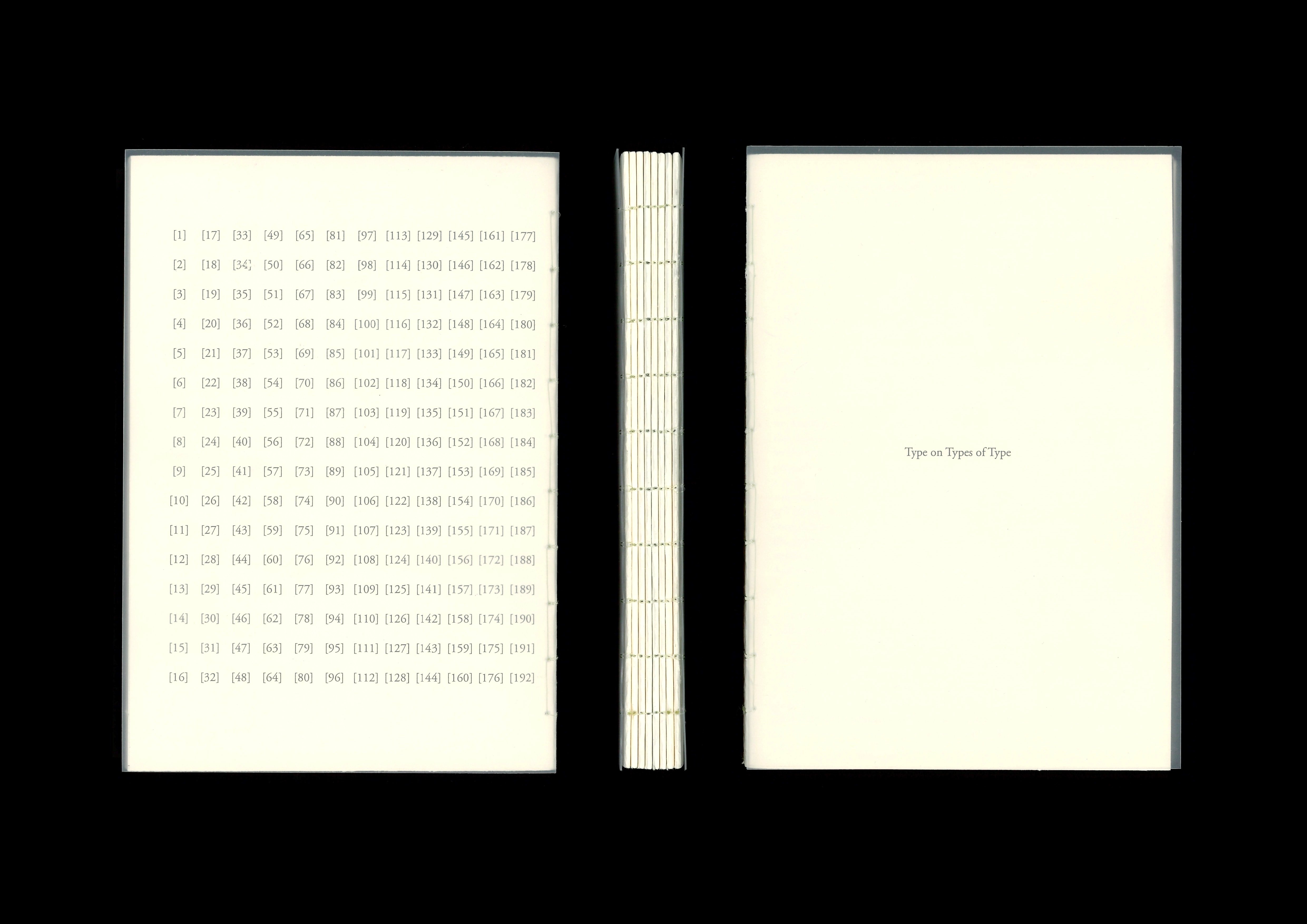
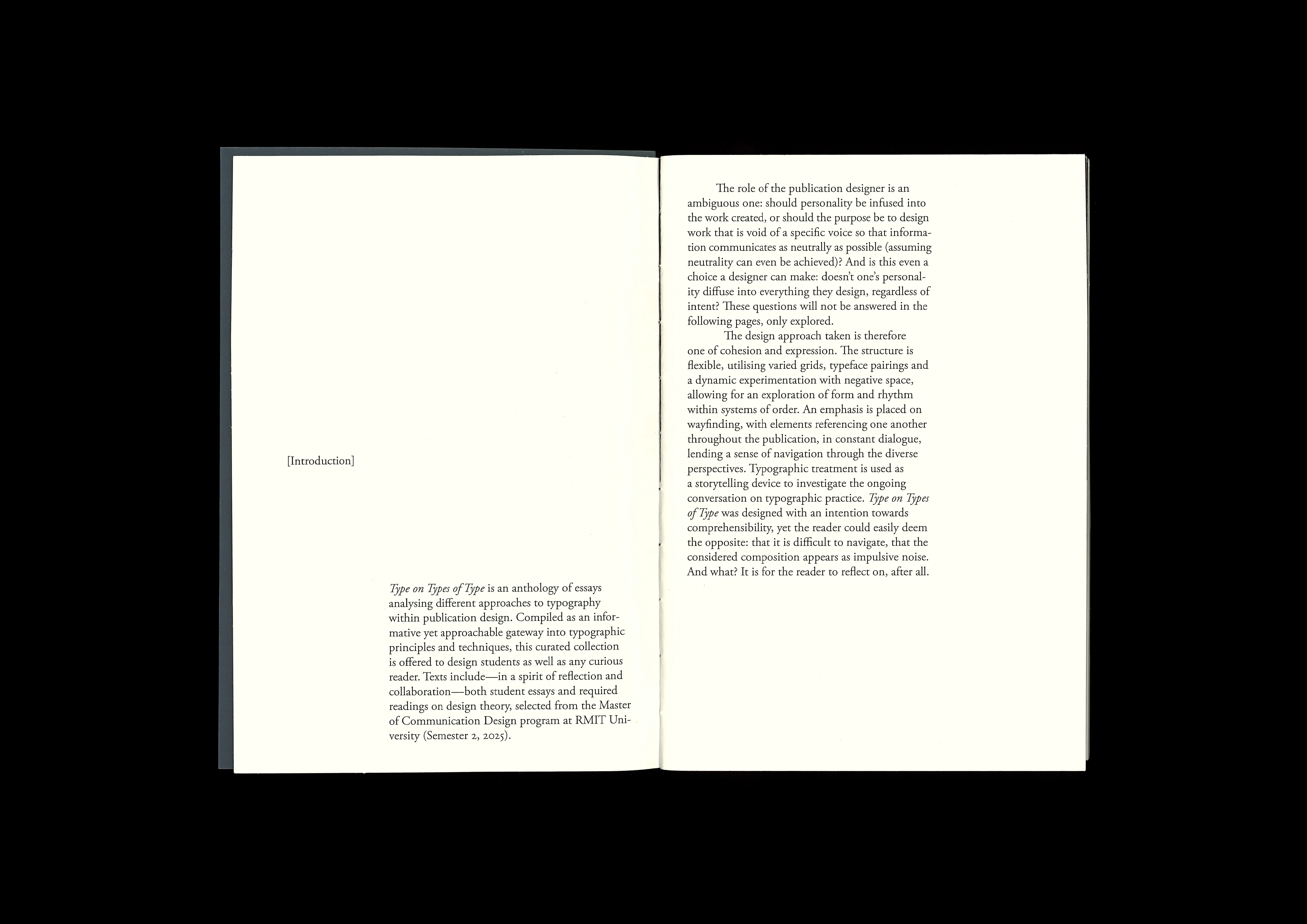
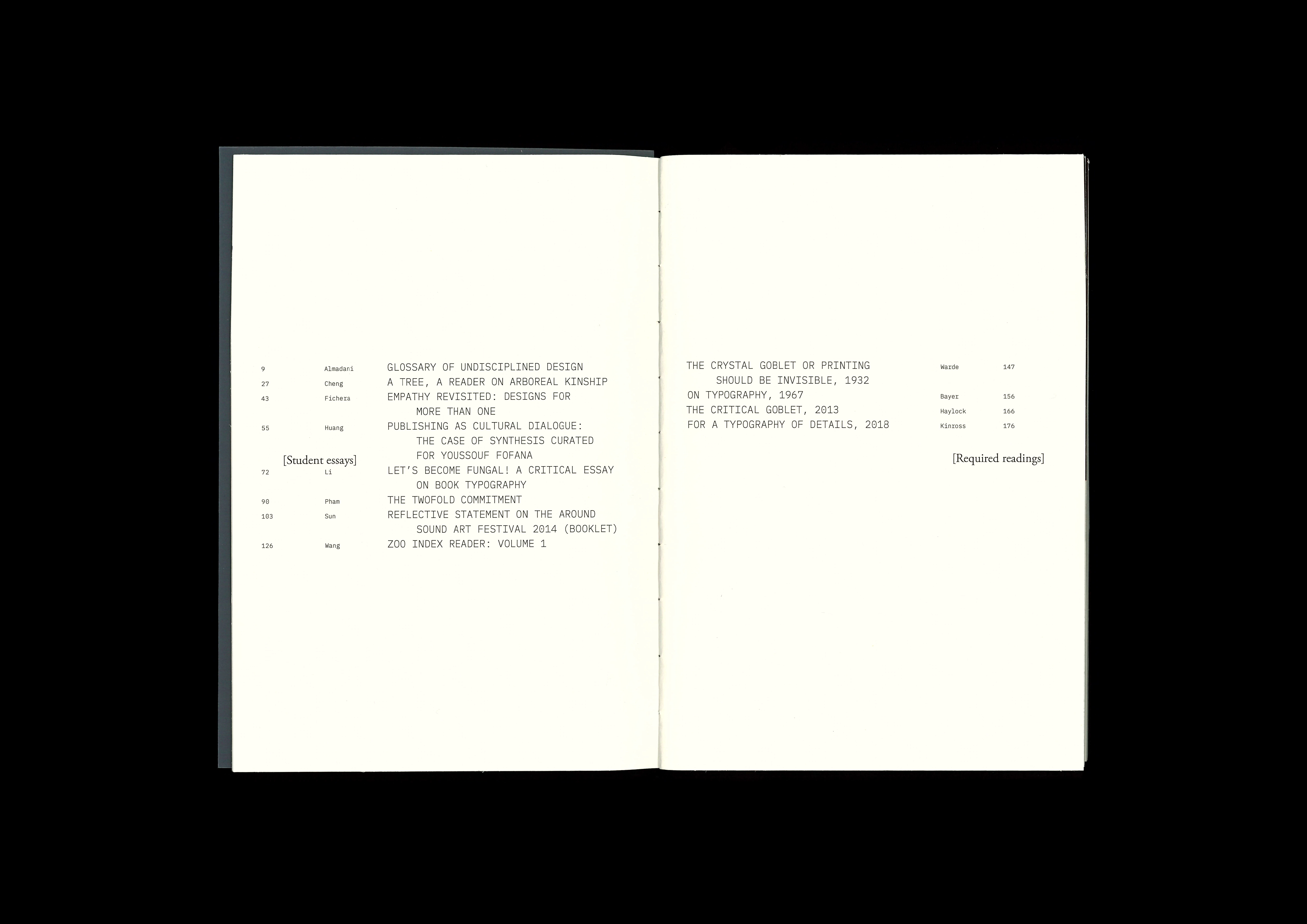
Type on Types of Type
(Publication)
An anthology of essays on different approaches to typography within publication design.
Curated, edited and typeset as an informative yet approachable gateway into typographic principles, for design students as well as any curious reader. Includes self-written introduction and original images.
Printed on bulky newsprint and semi-transparent polypropolene; handbound with fishing wire.
Waking Moment
(Short film)
An experimental short film exploring moments of stillness; decisive and fleeting. Like objects left in darkness picking up a faint sheen of reflected light.
Inspired by excerpt: “I need only pause before it and I forget the passage of time,” from In Praise of Shadows—Jun’ichirō Tanizaki.
Frames include digital video and 35mm film stills, collaged and scanned. Sound includes found audio and edited instrumental from Sour Times—Portishead.
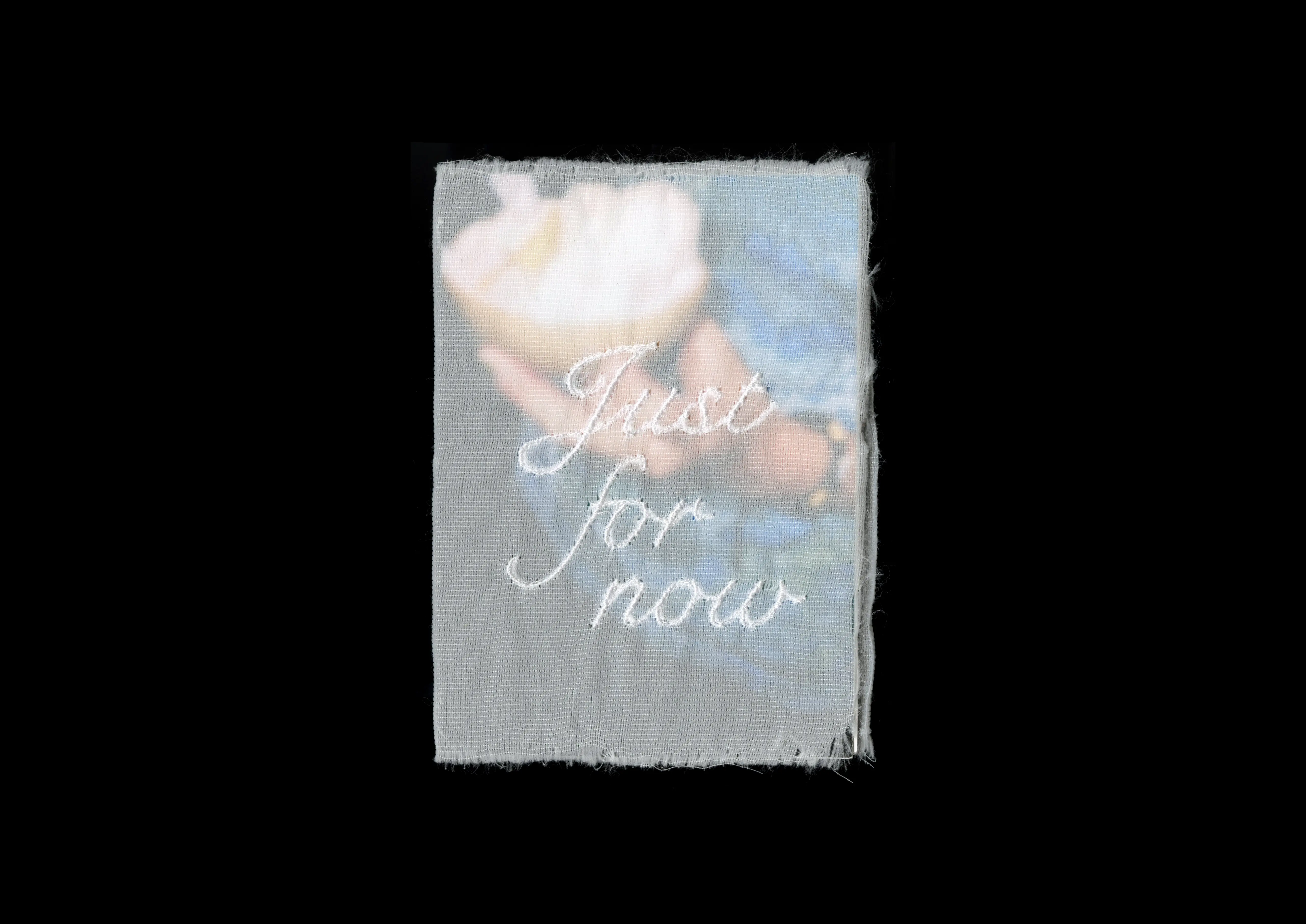
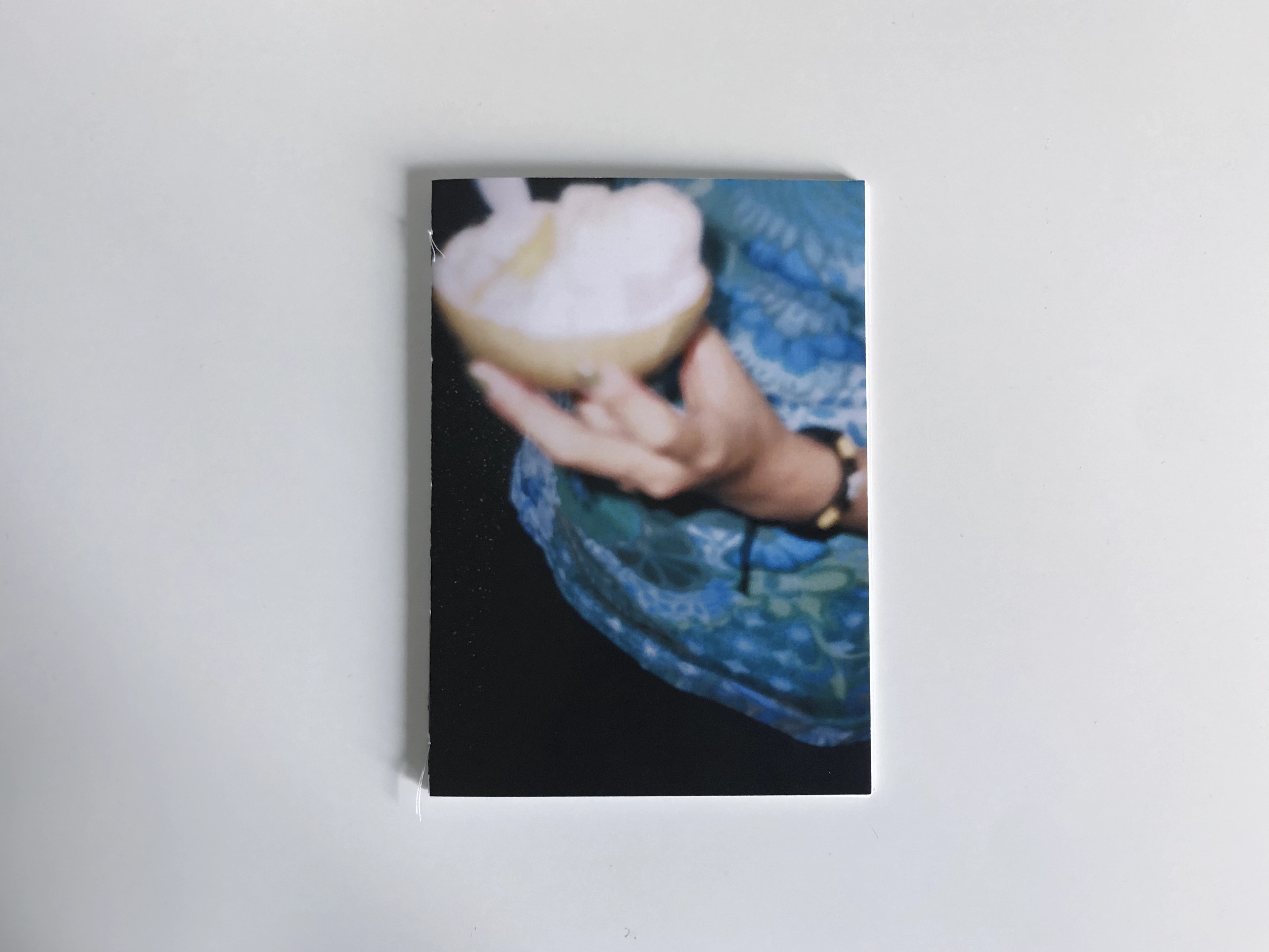
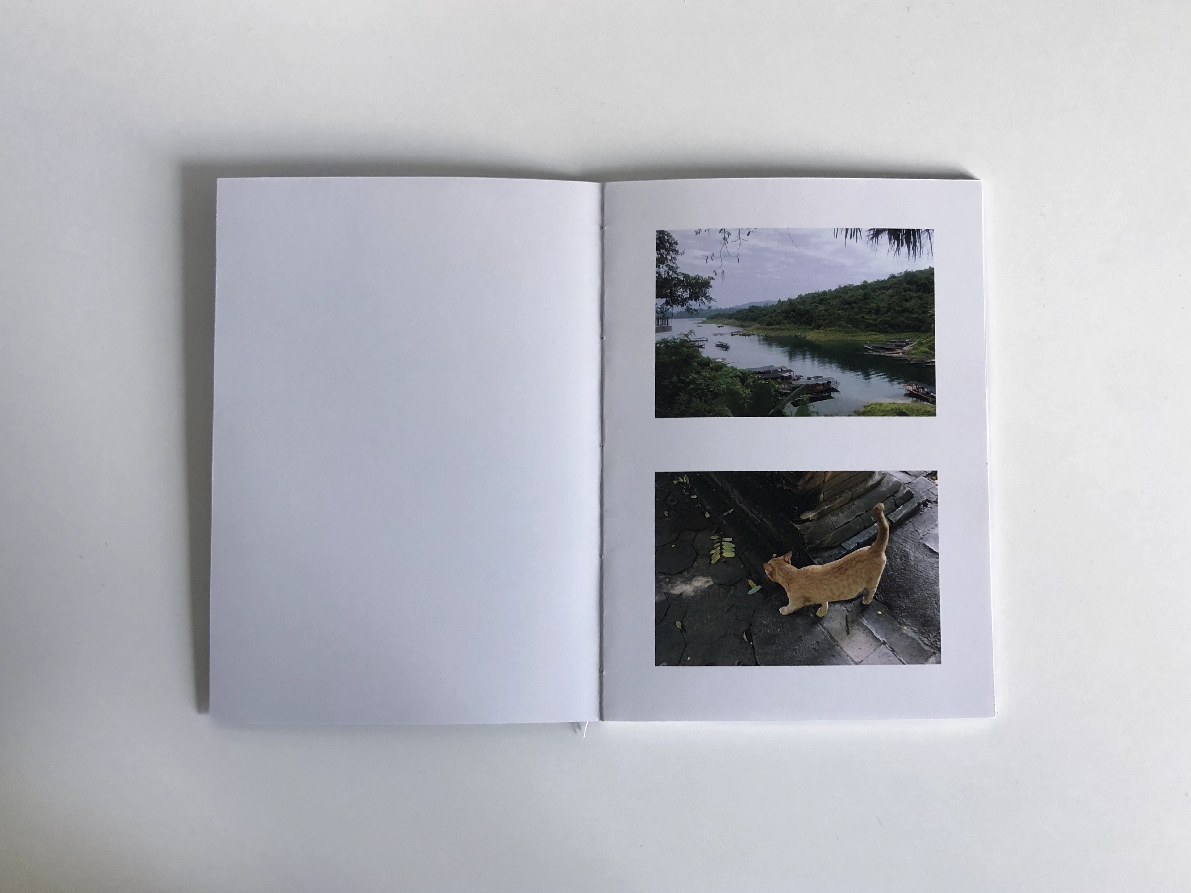
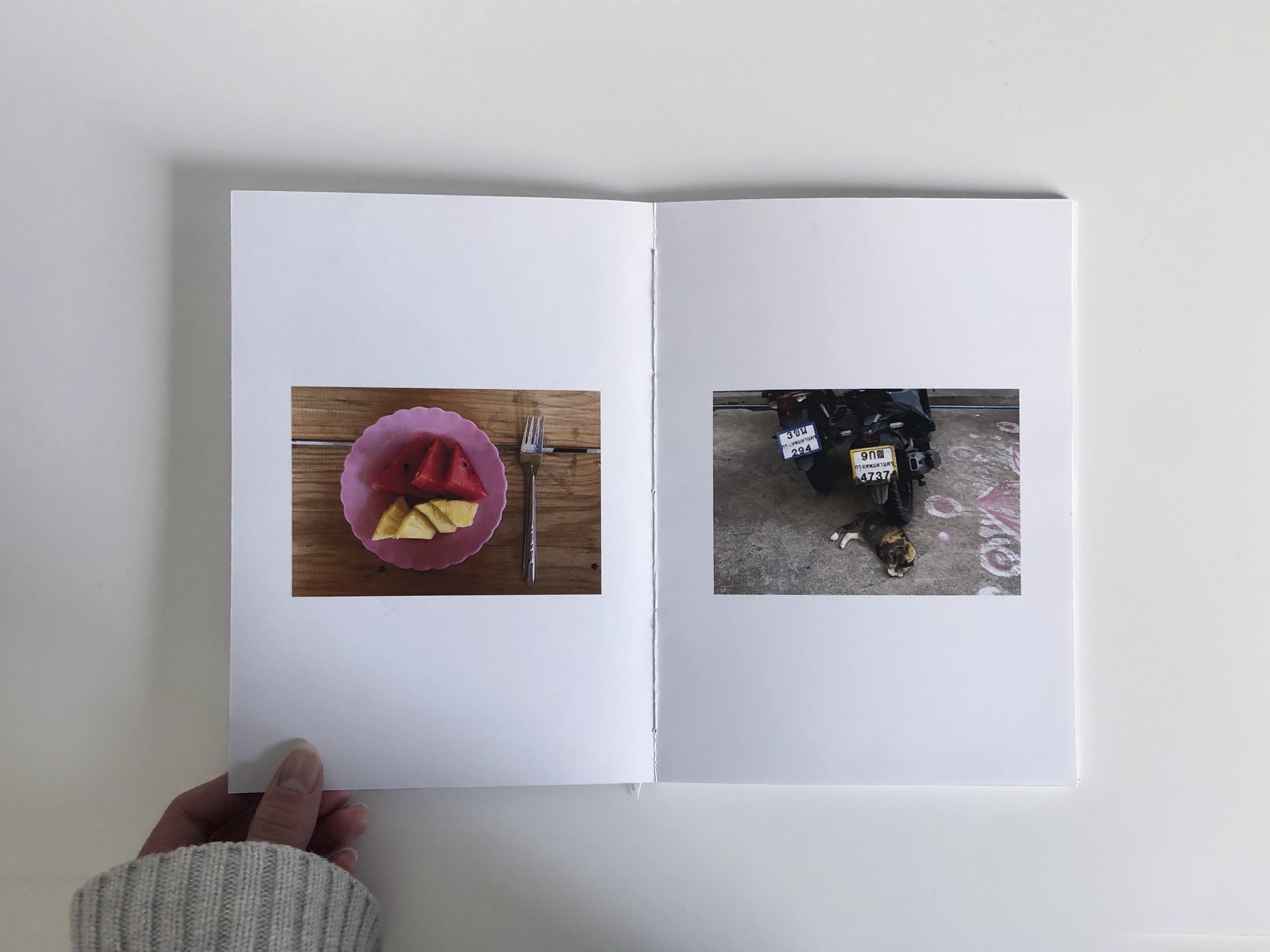
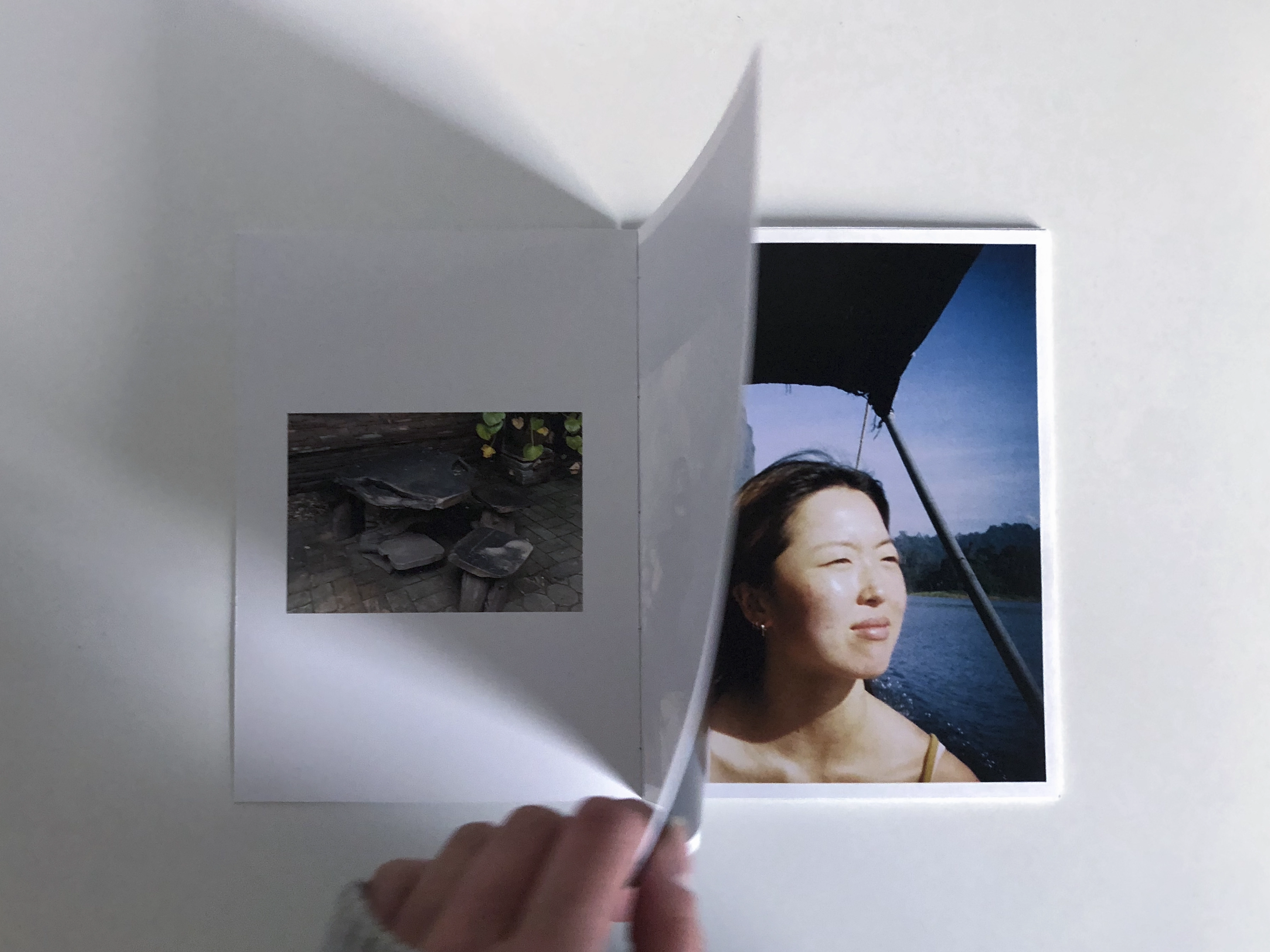
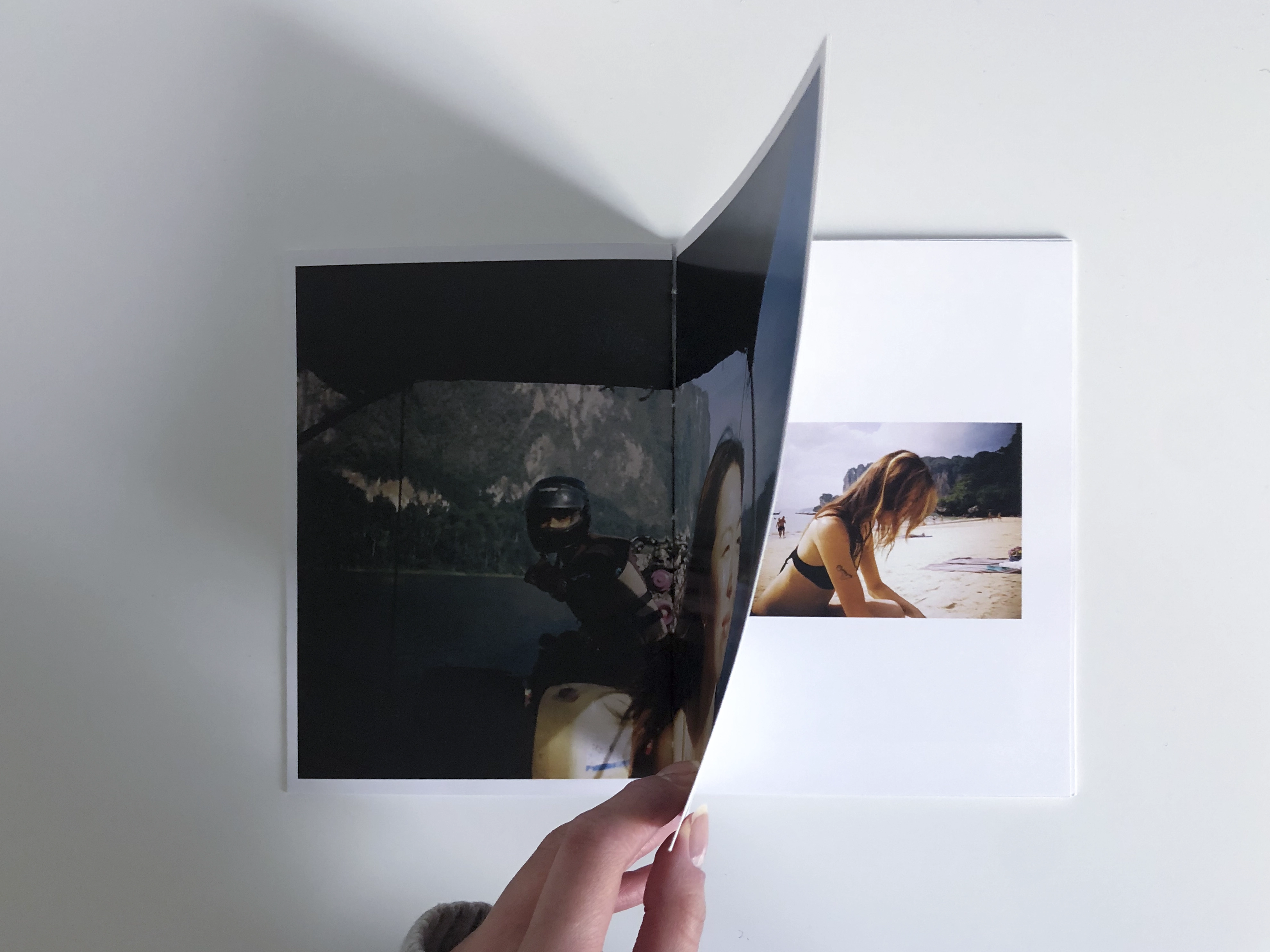
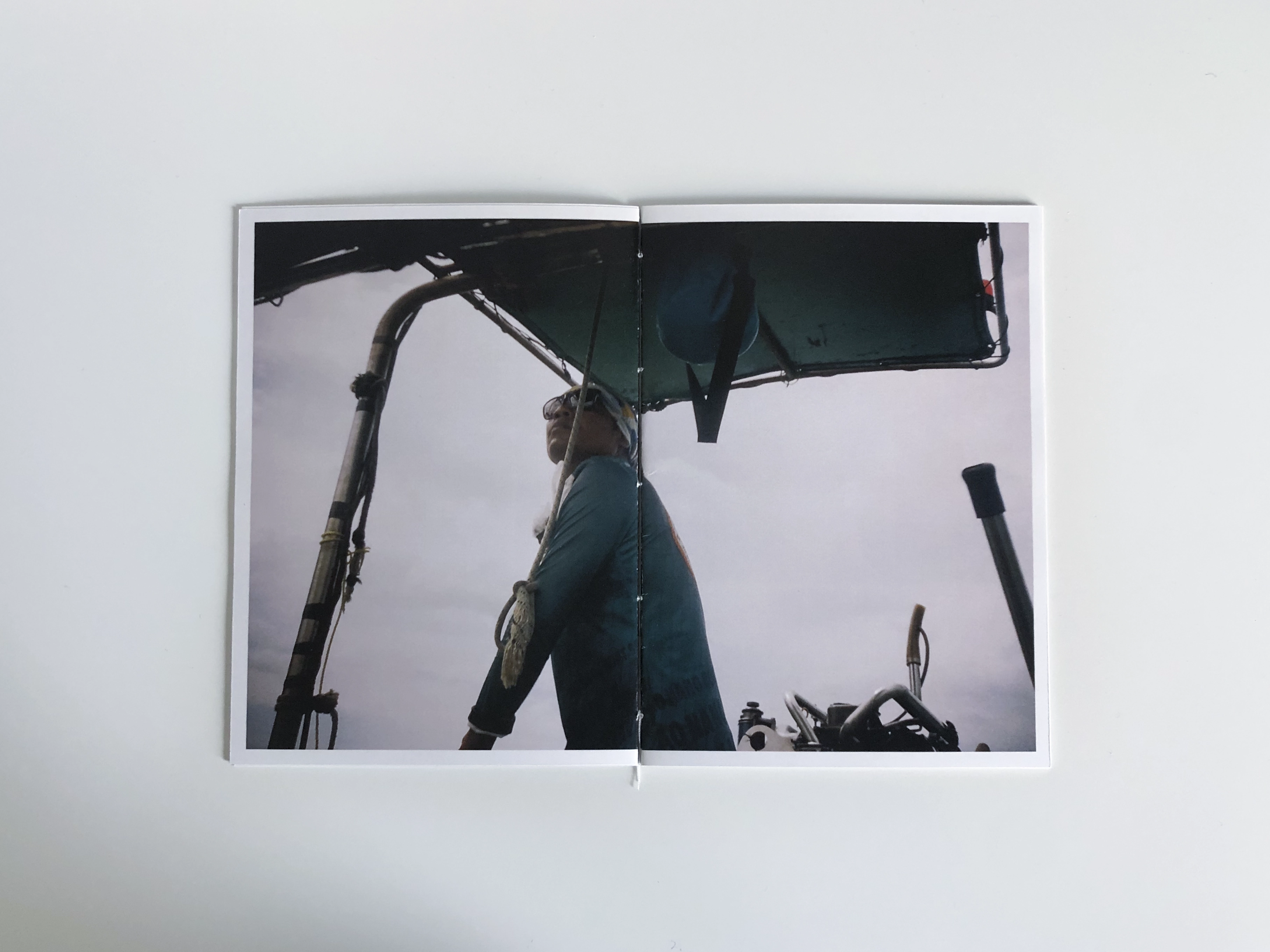
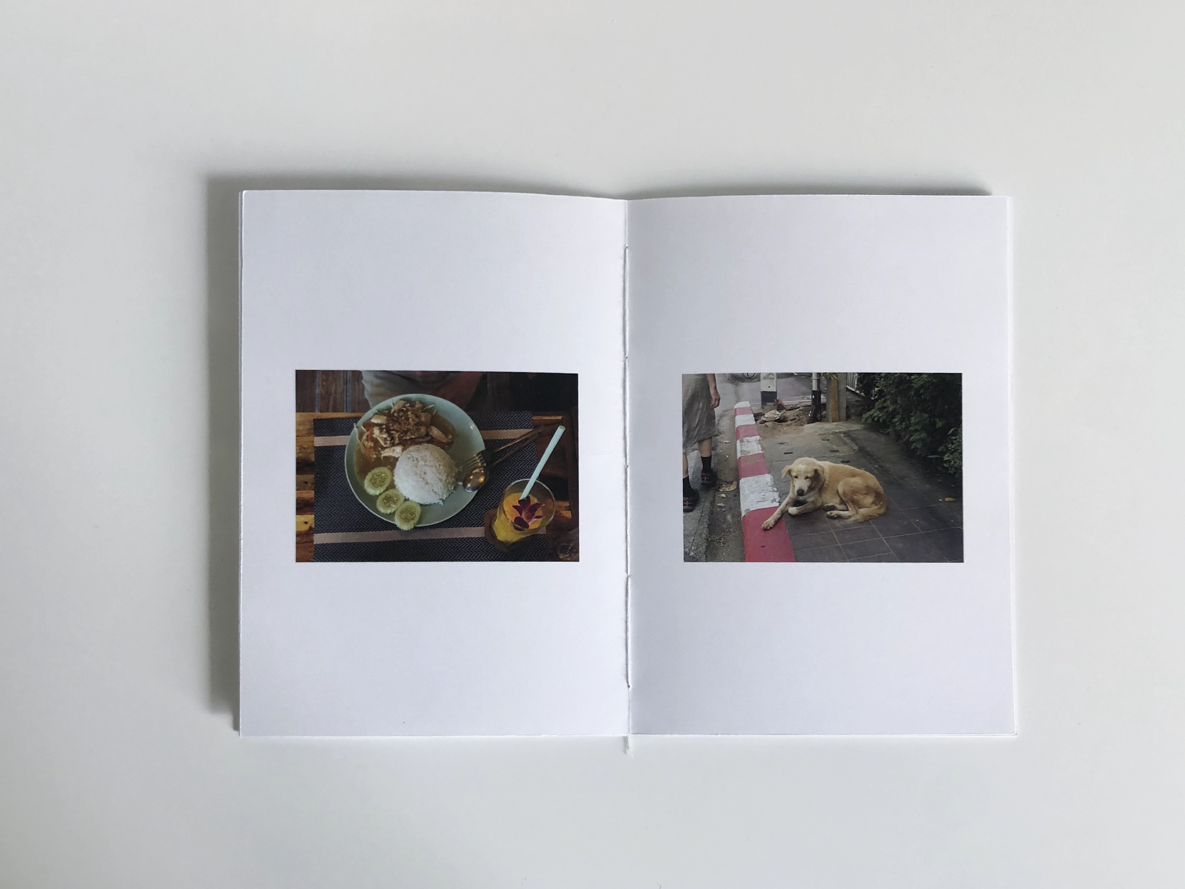
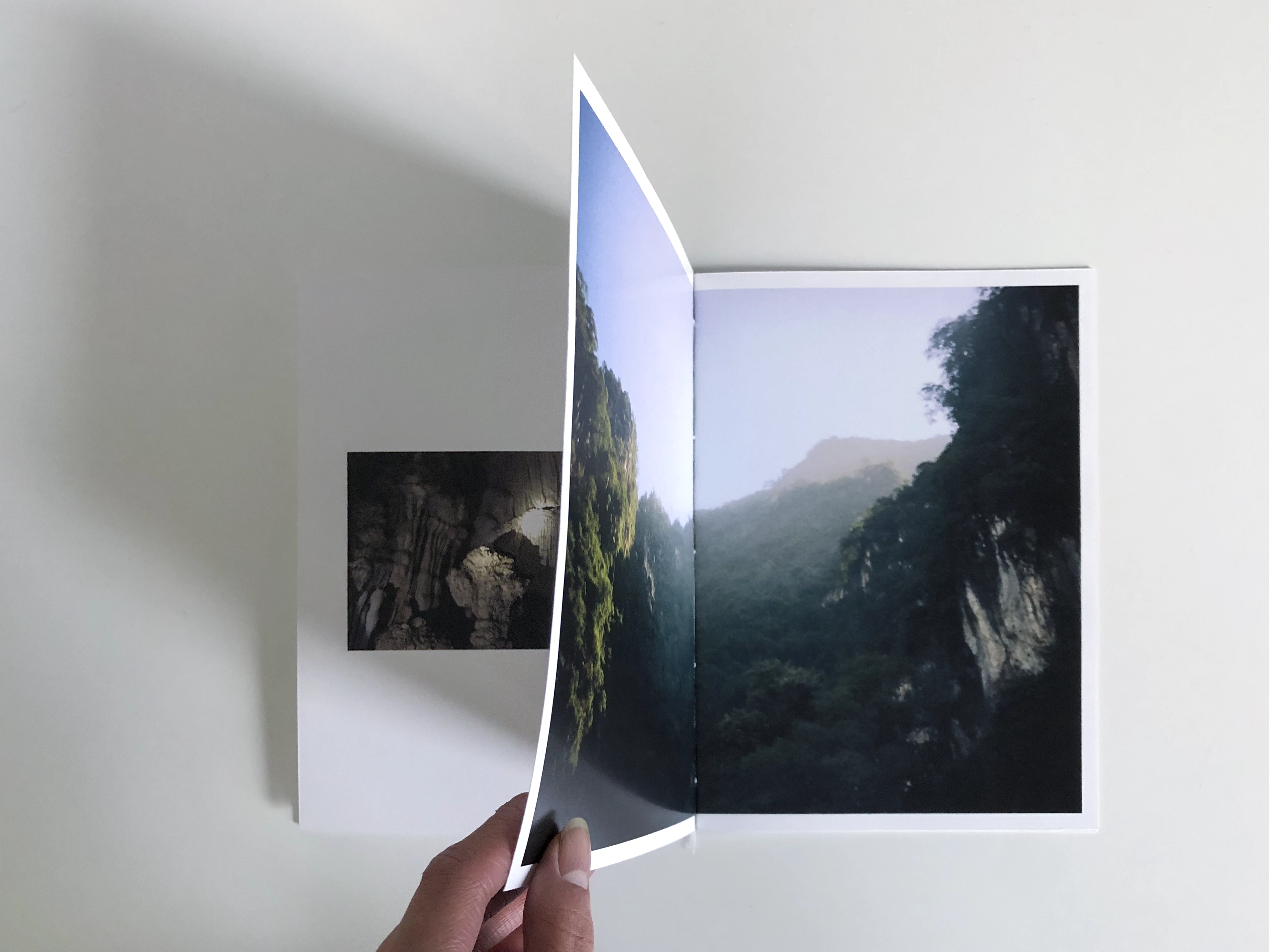
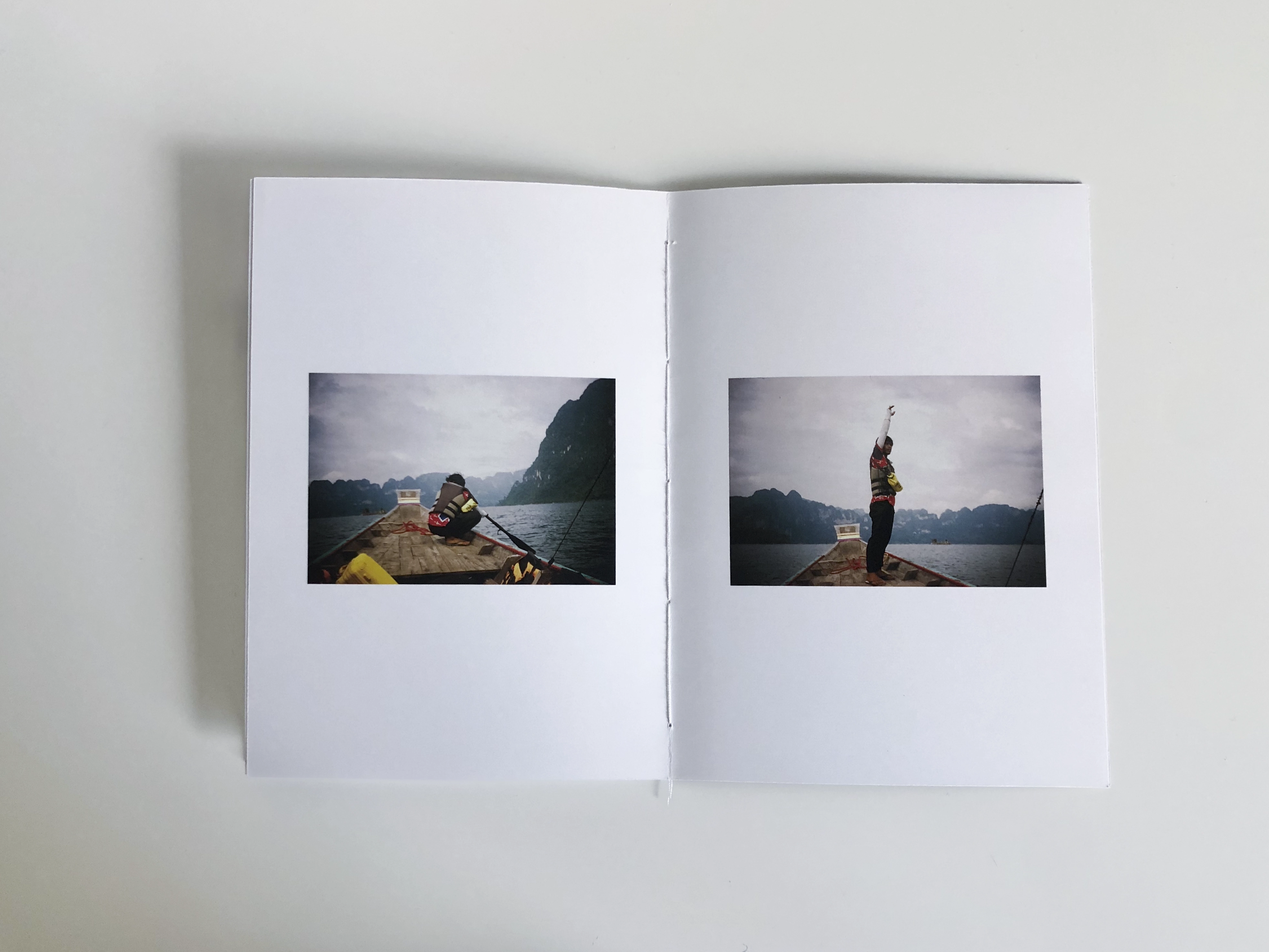
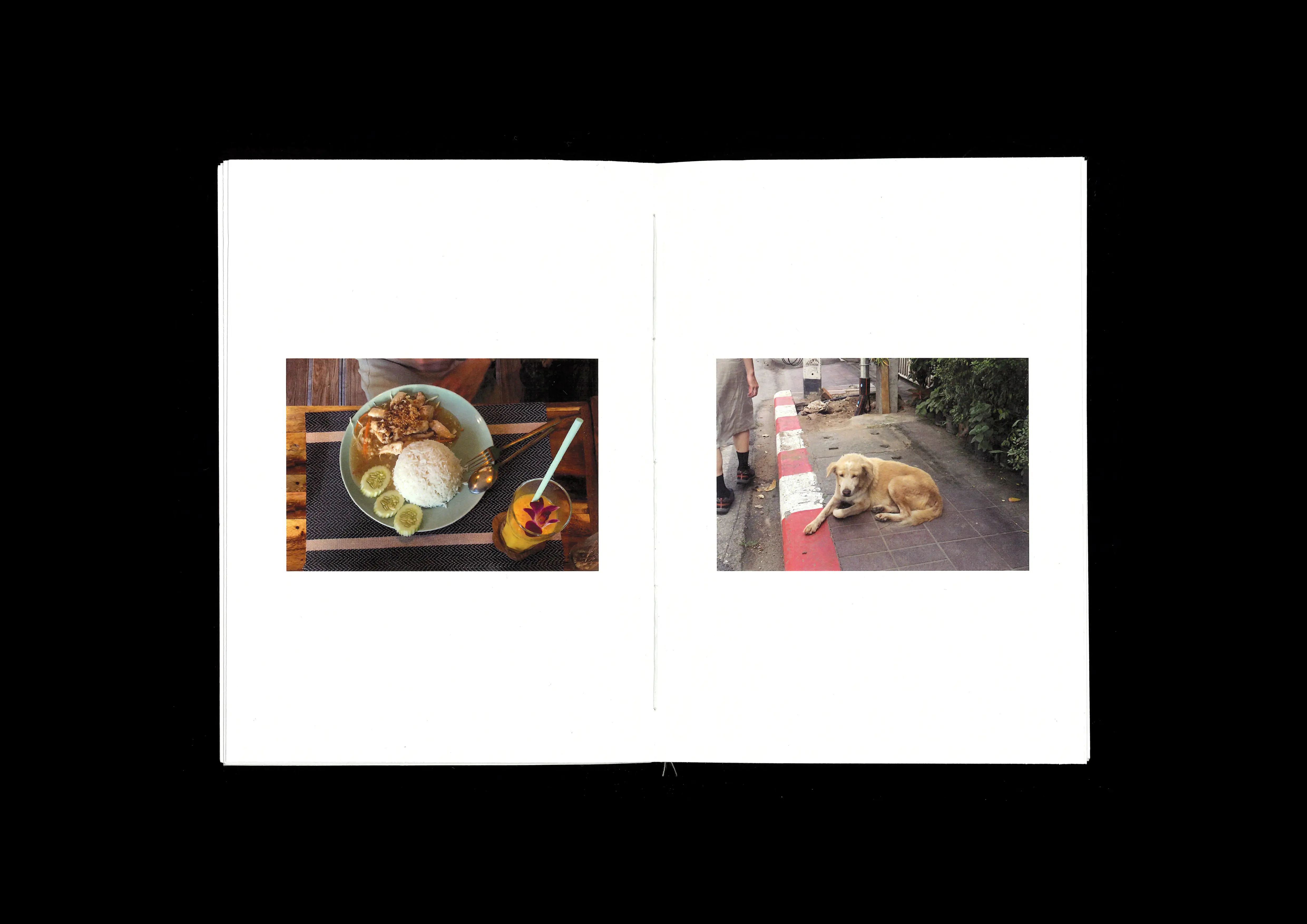
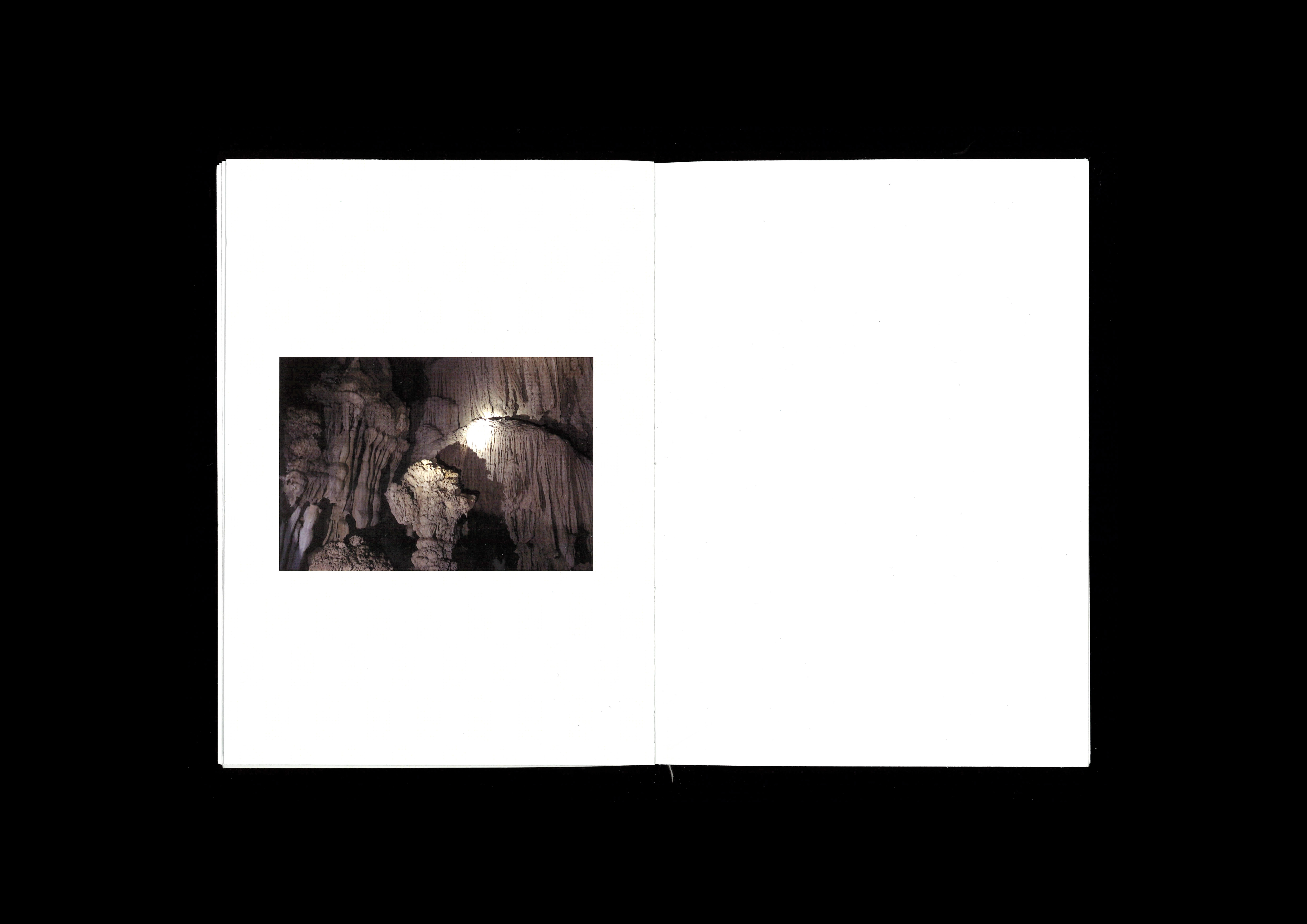
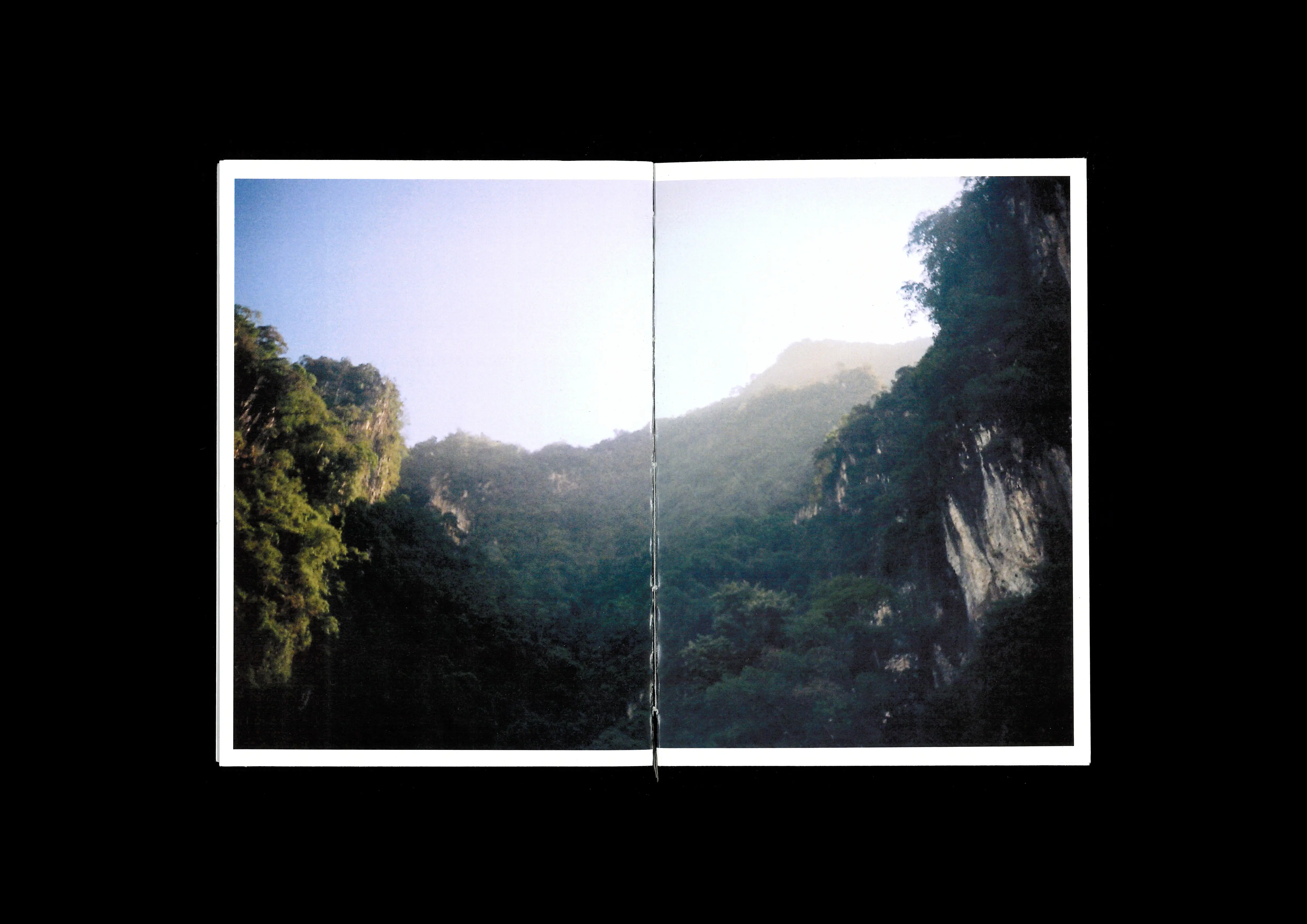
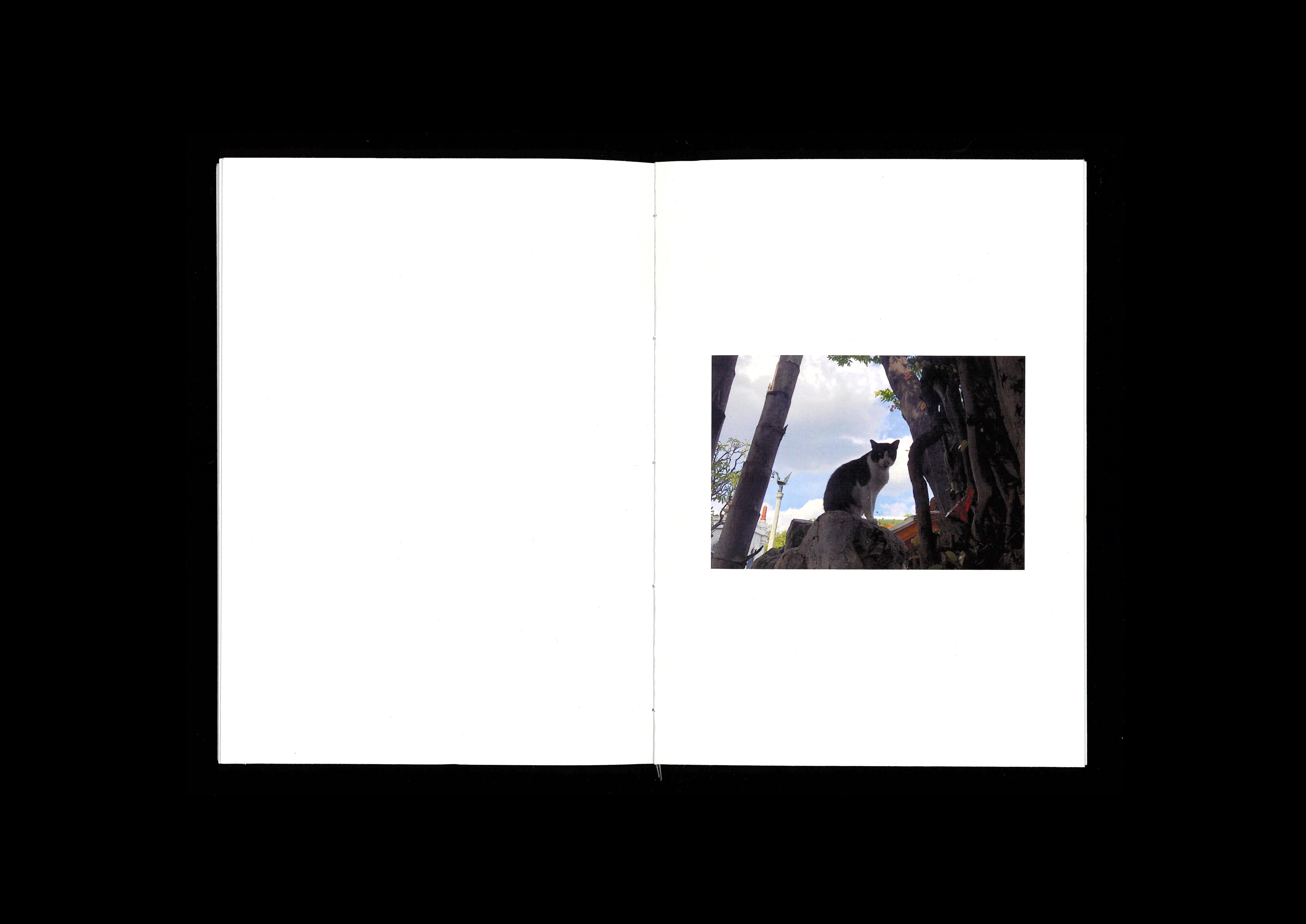
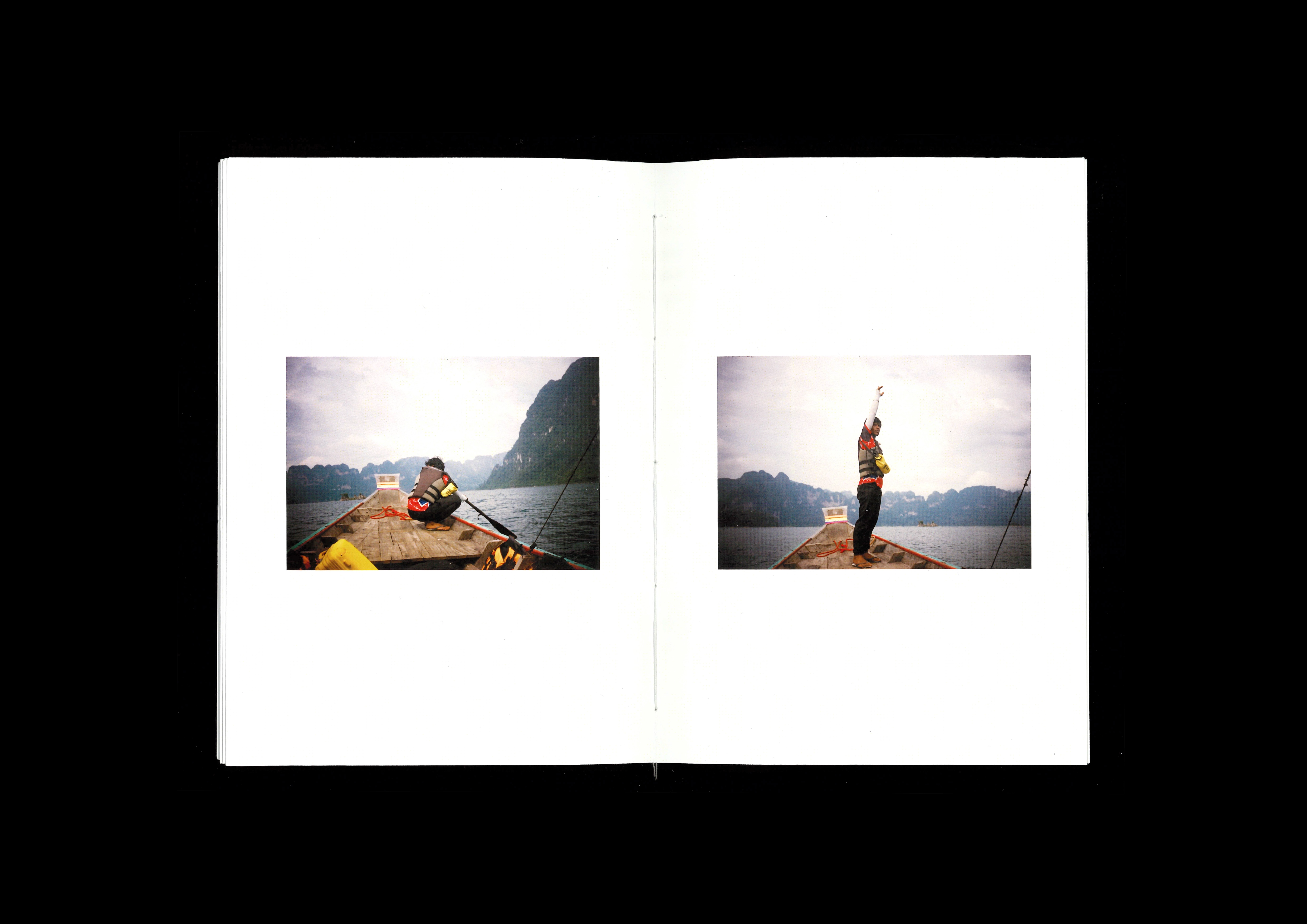
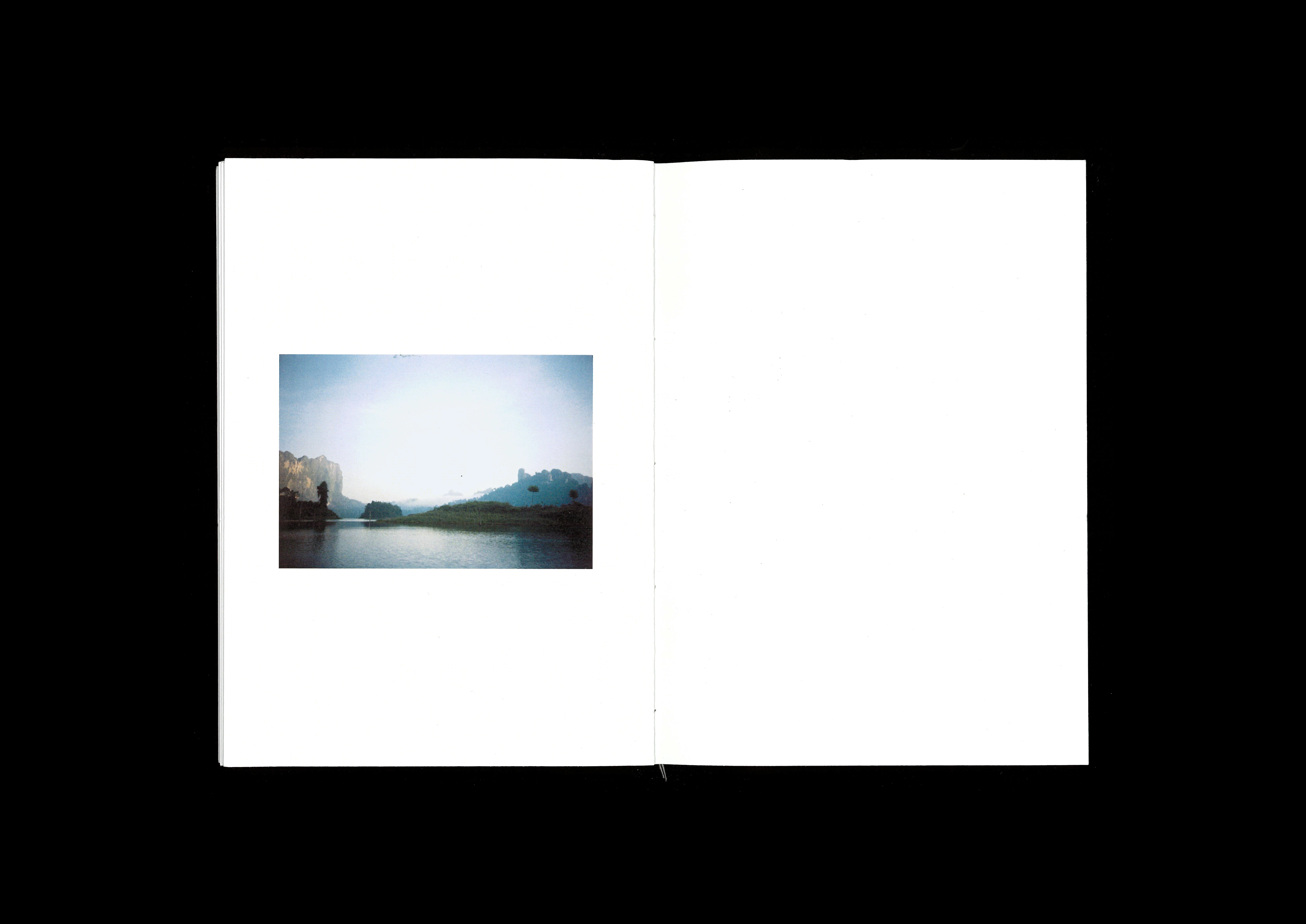
Just For Now
(Publication, Photography)
A photobook documenting observations of a brief odyssey. Quiet moments and visual notes are collected as messages meant for home.
Shot on 35mm film and digital; handbound with white-thread and wrapped in embroidered dust jacket.

Eurostile Specimen
(Typography)
An experimental type specimen for Eurostile, a 1962 typeface by Aldo Novarese.
Novarese described Eurostile as a “synthetic expression of (their) times,” designing the typeface as a symbol of 60’s civilisation. He drew inspiration from the geometric forms of mid-century architecture and design, such as the period’s train windows and television frames.
The specimen is therefore inspired by architectural blueprints and their traditional cyanotype process.

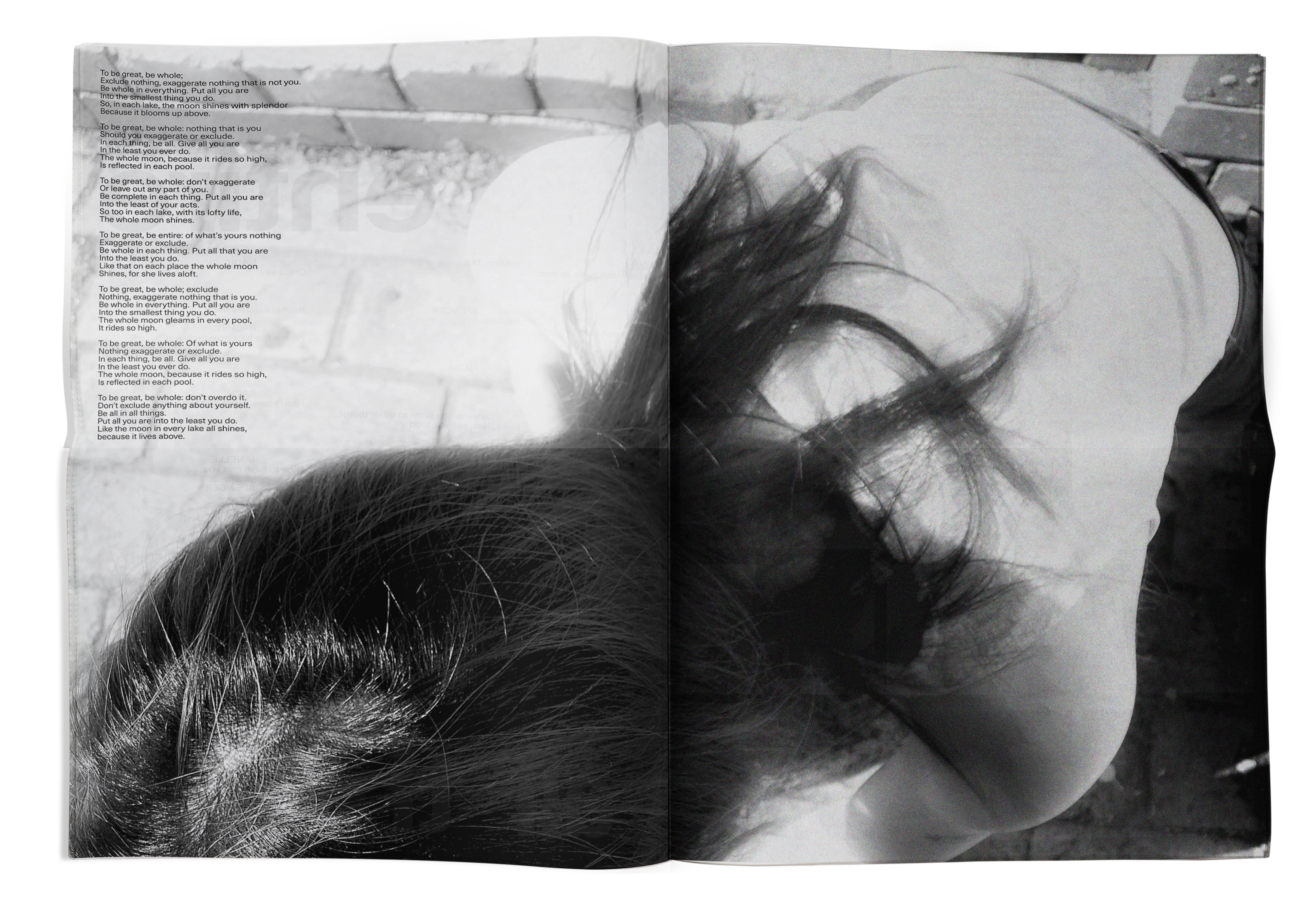
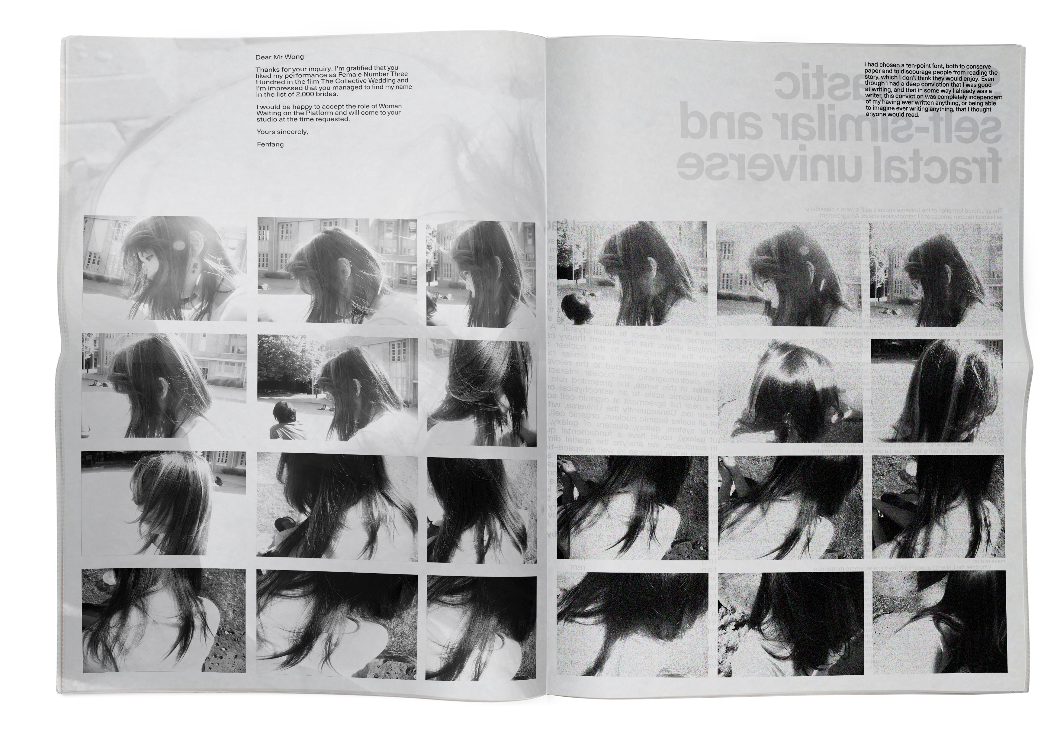
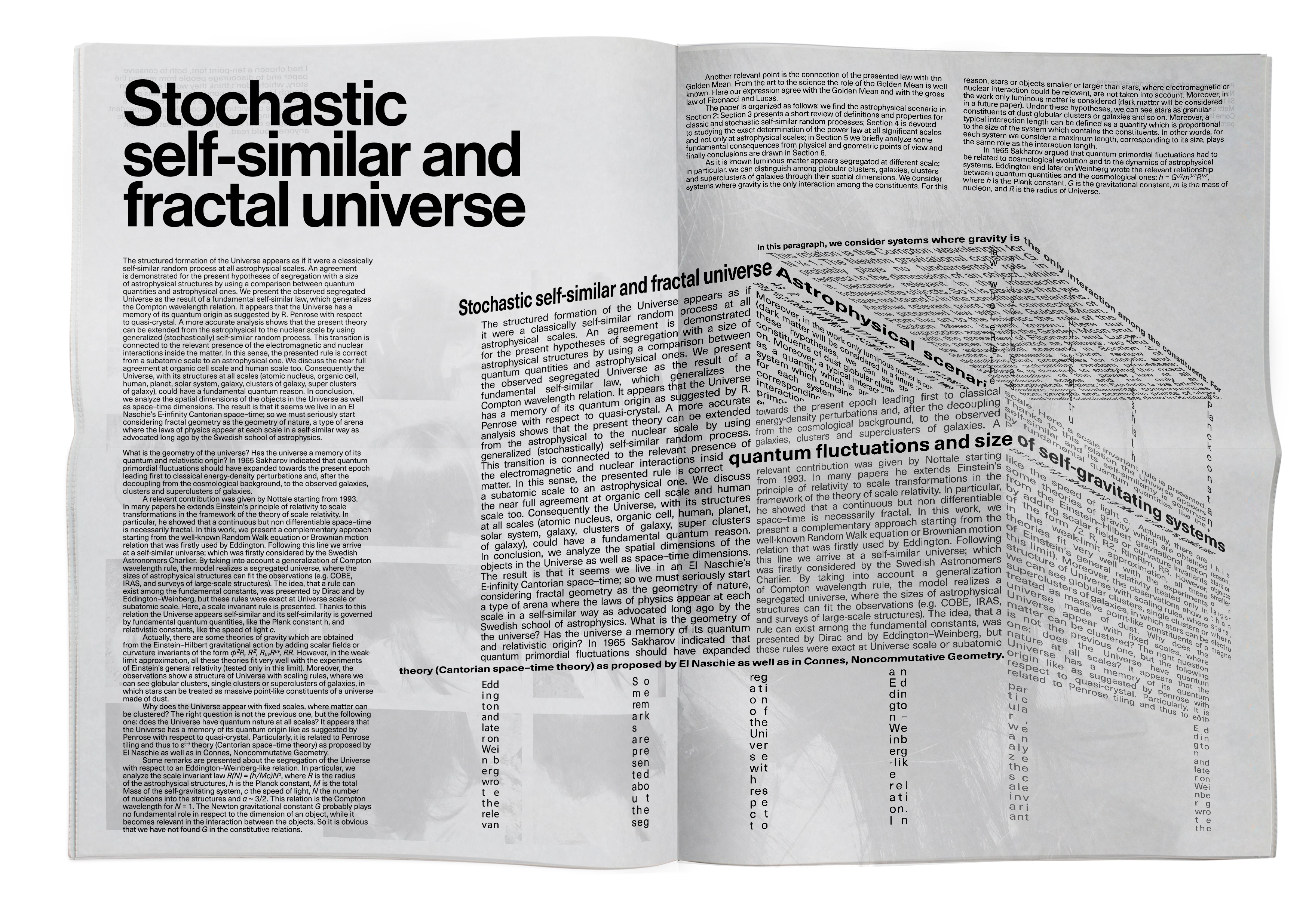
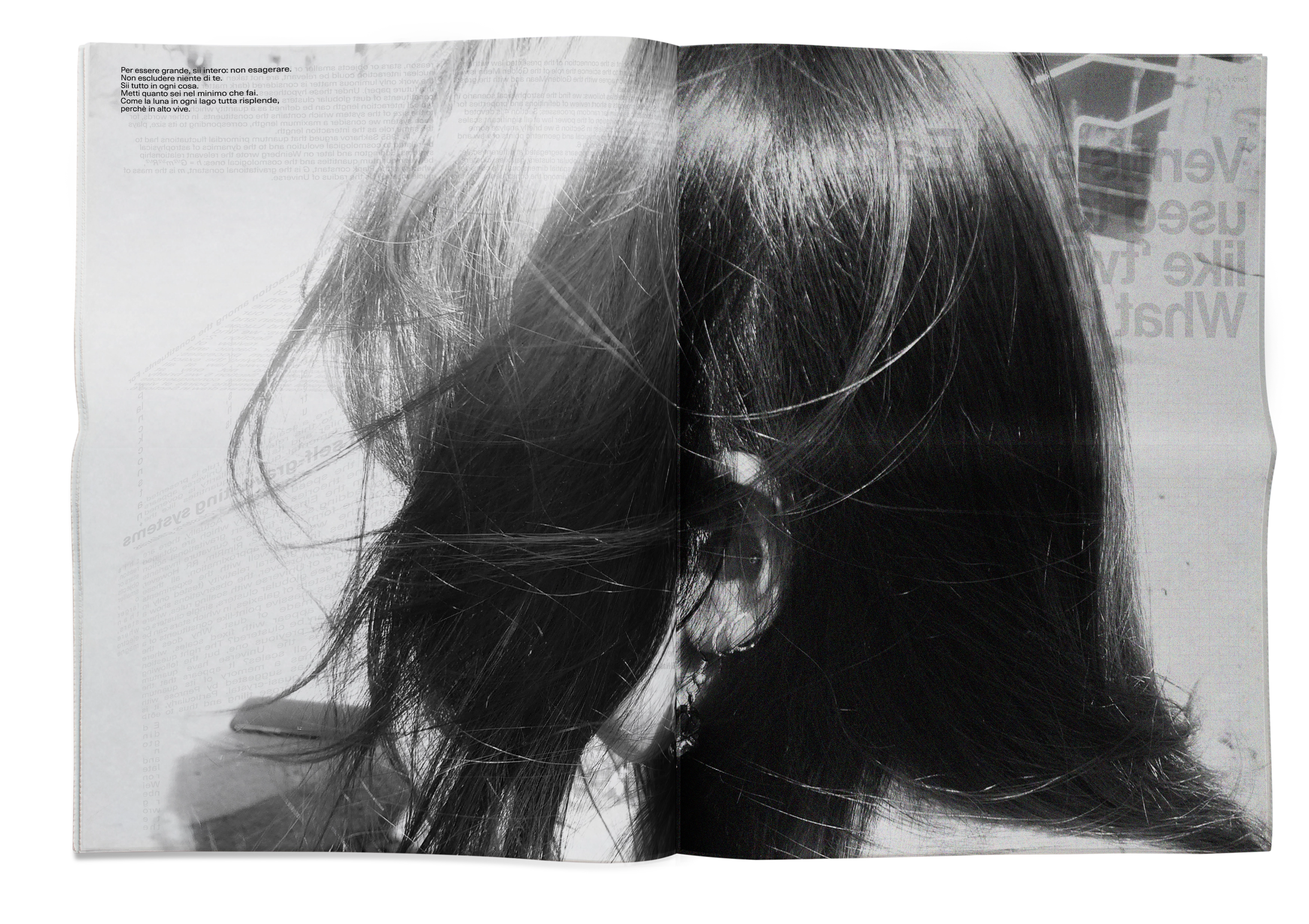
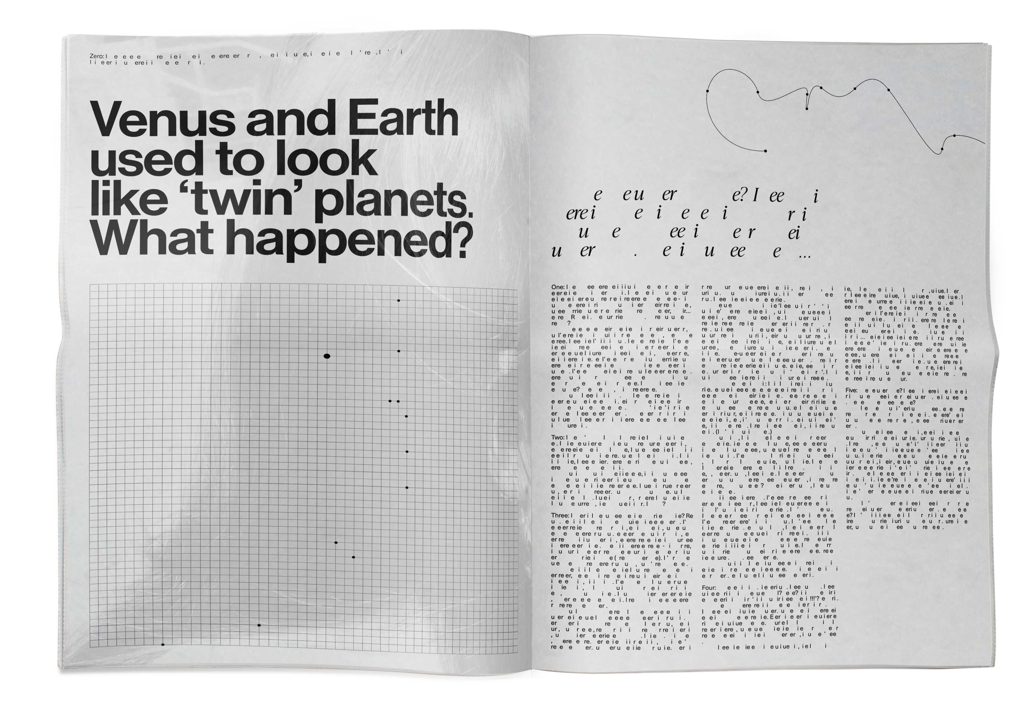
Counterpart
(Publication)
An experimental newspaper reflecting on my lived experience of twinhood.
An investigation into the idea of existence as a constituent of a whole, between symmetry and duality, as well as the commodification of twin identity in the media. A newspaper format is used to nod toward the accessibility and misinterpretation of twinhood.
Includes original photography and text; printed on 45gsm newsprint.
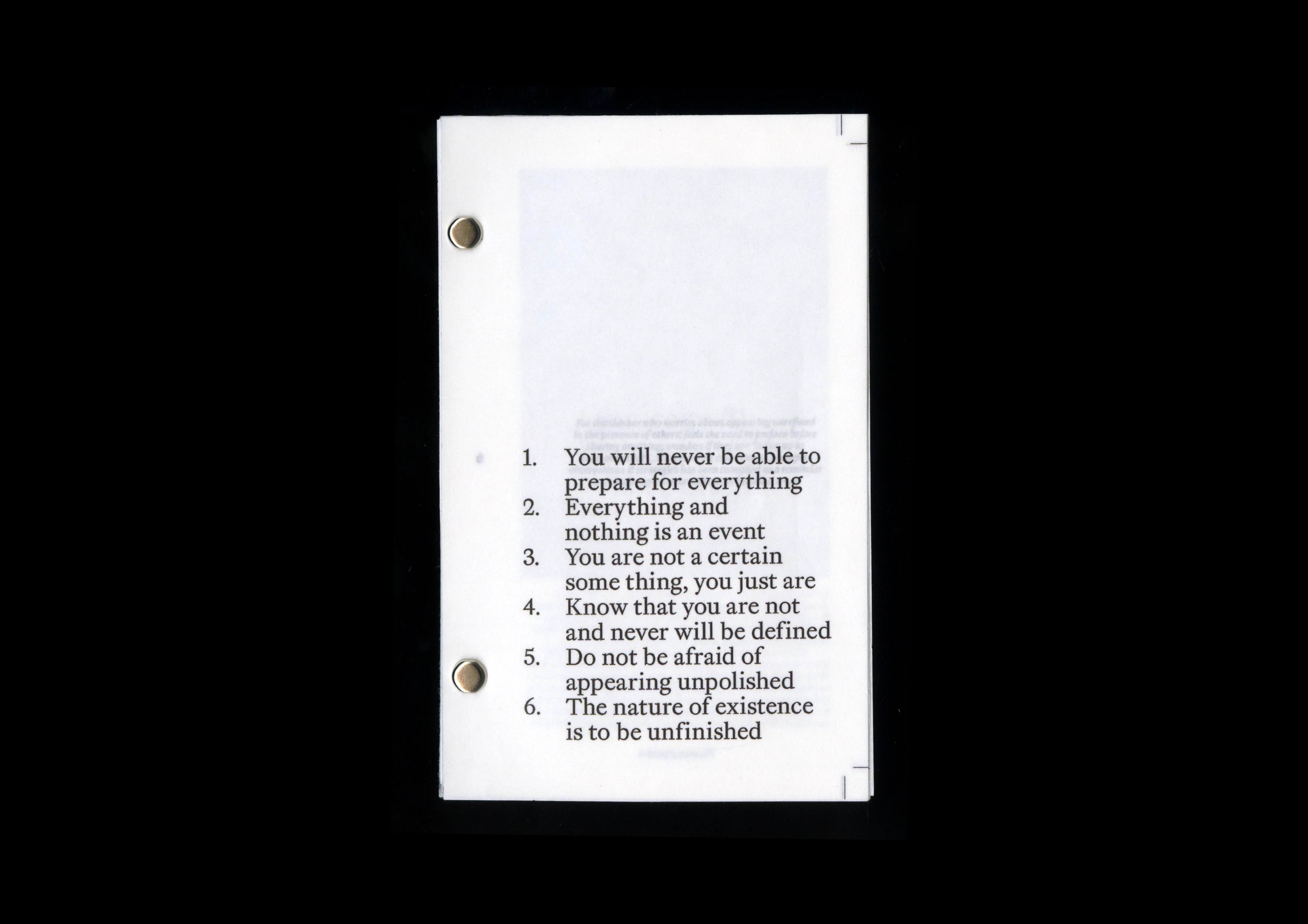
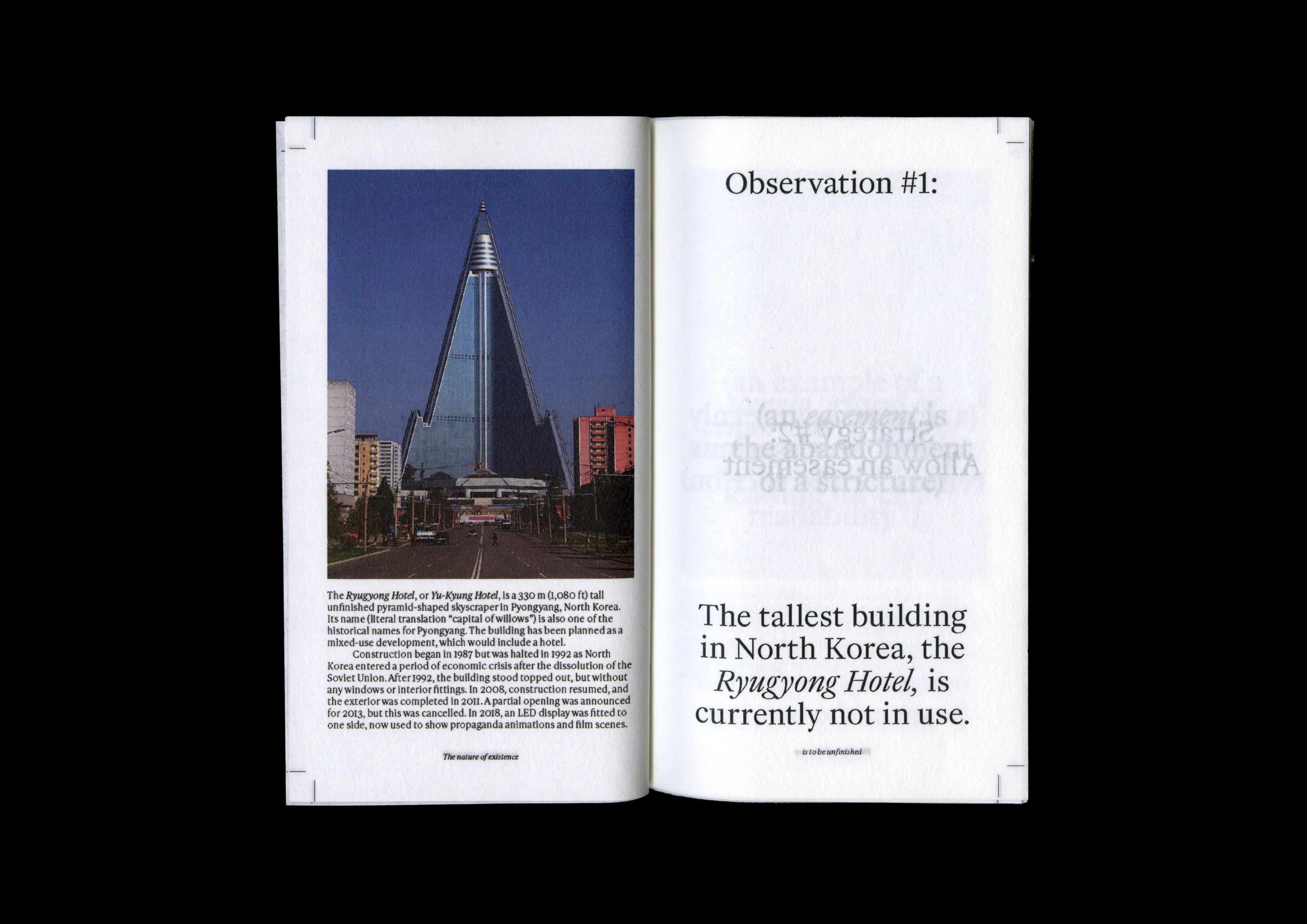
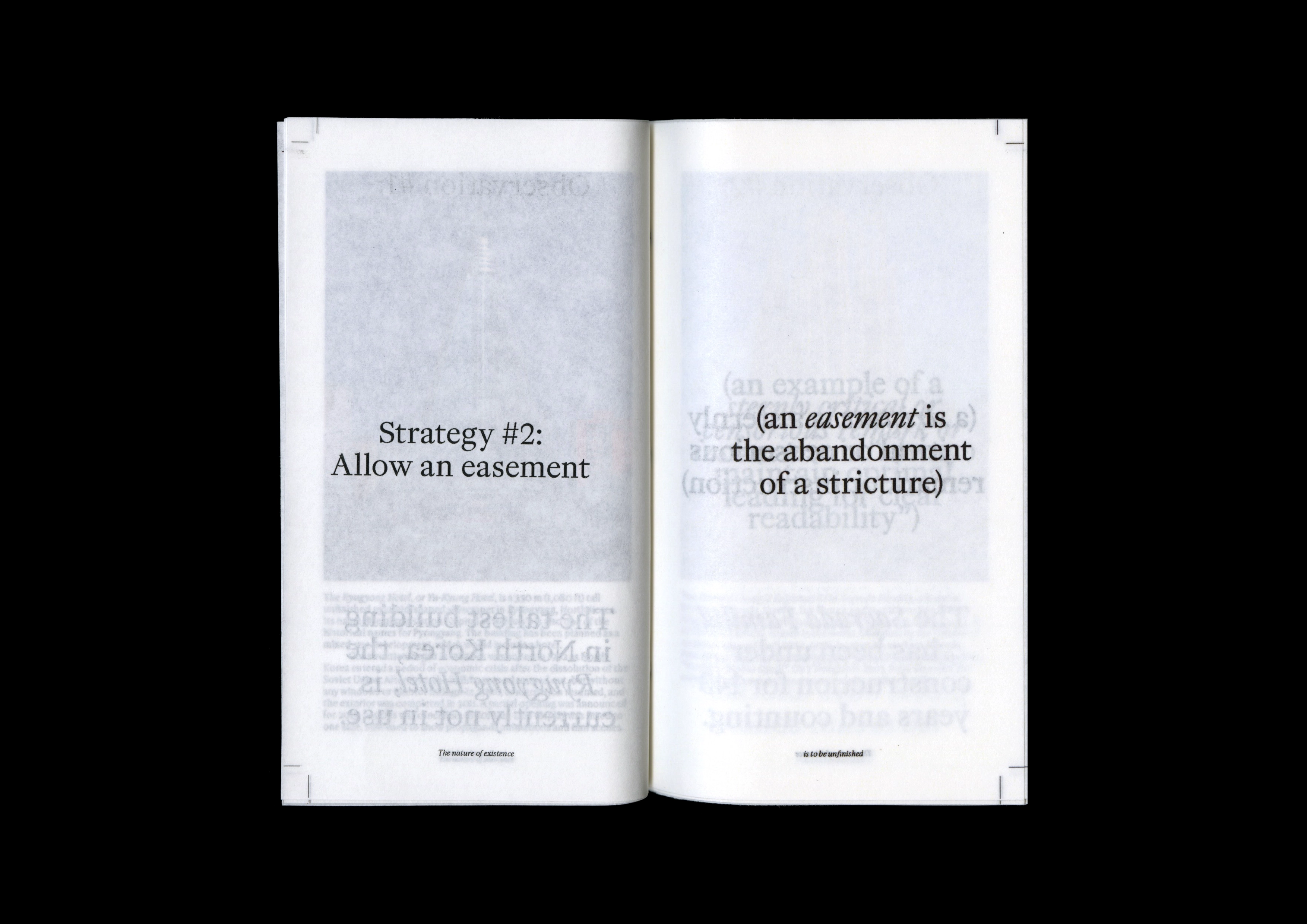
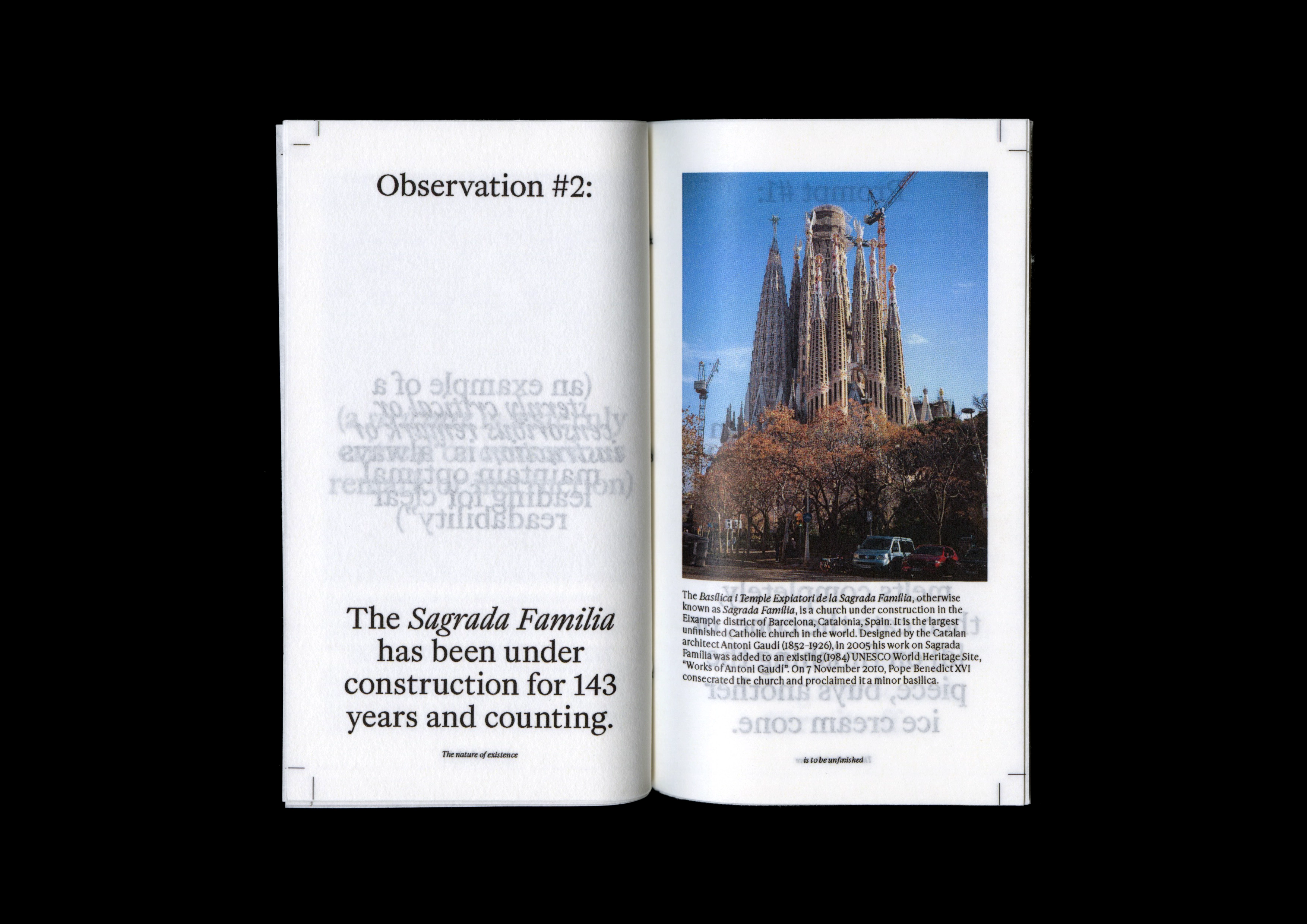
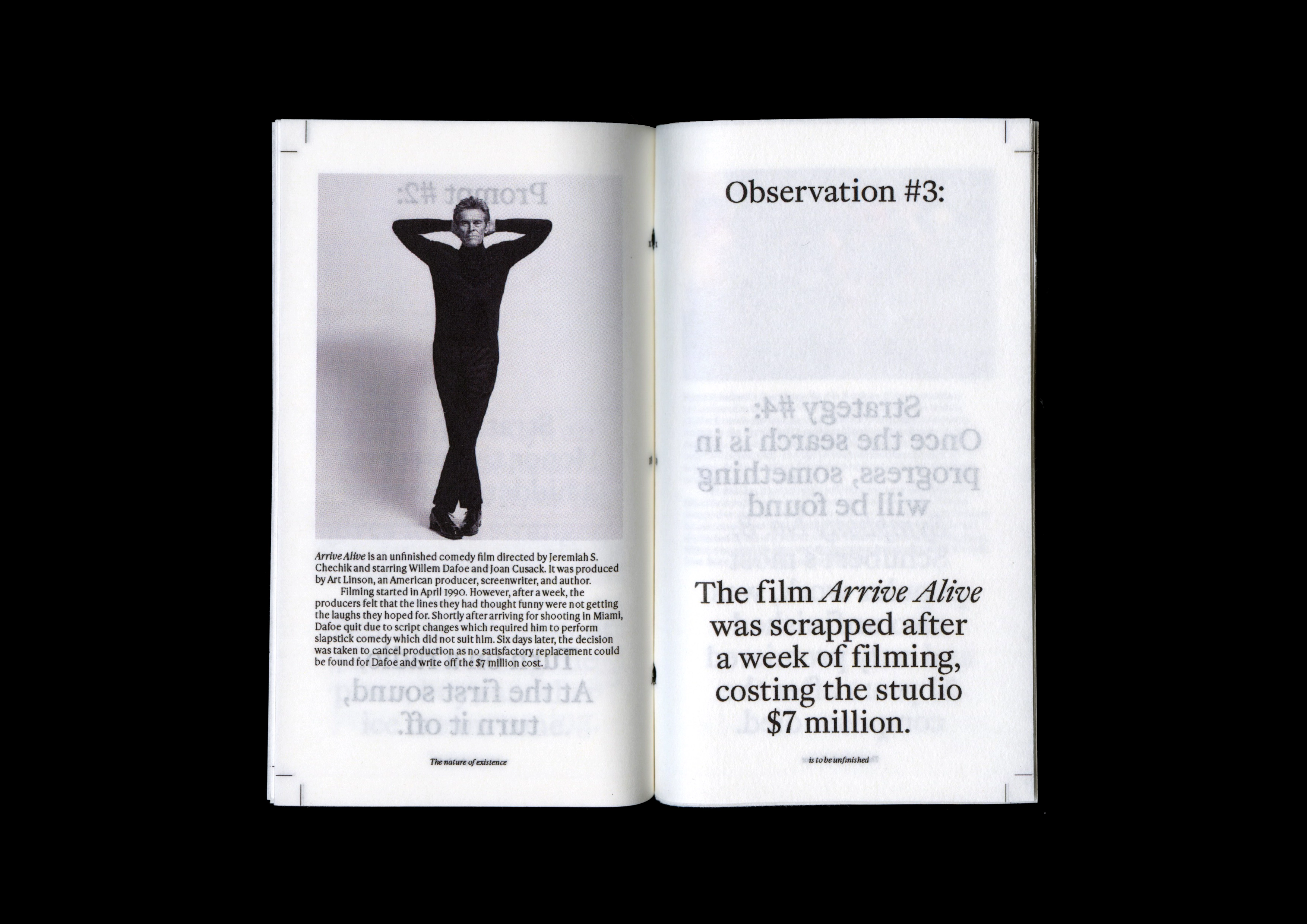
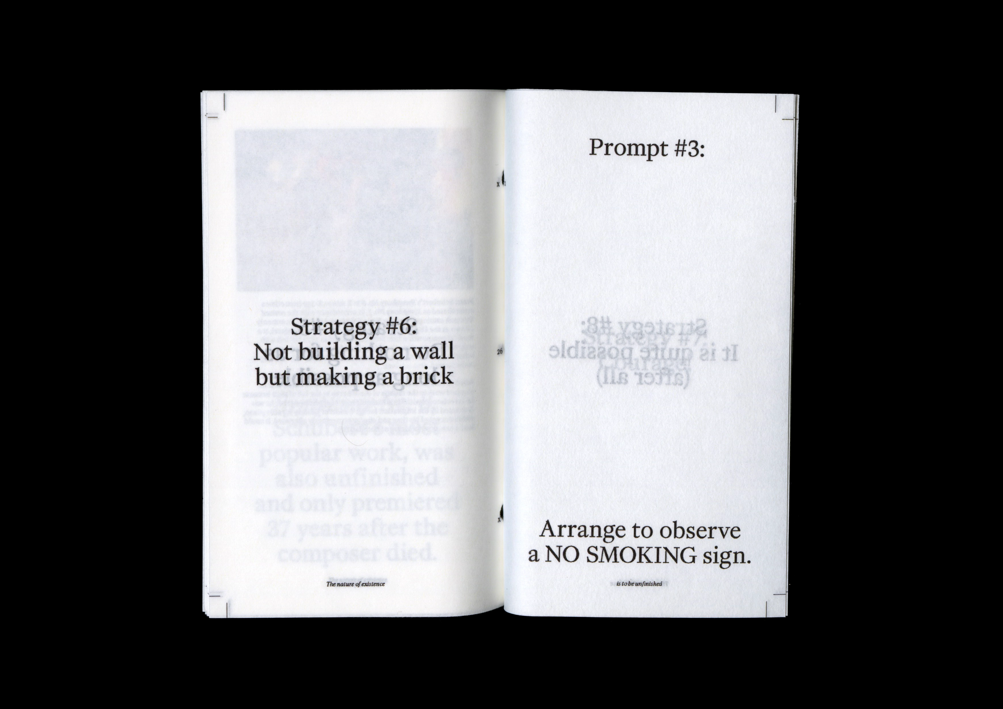
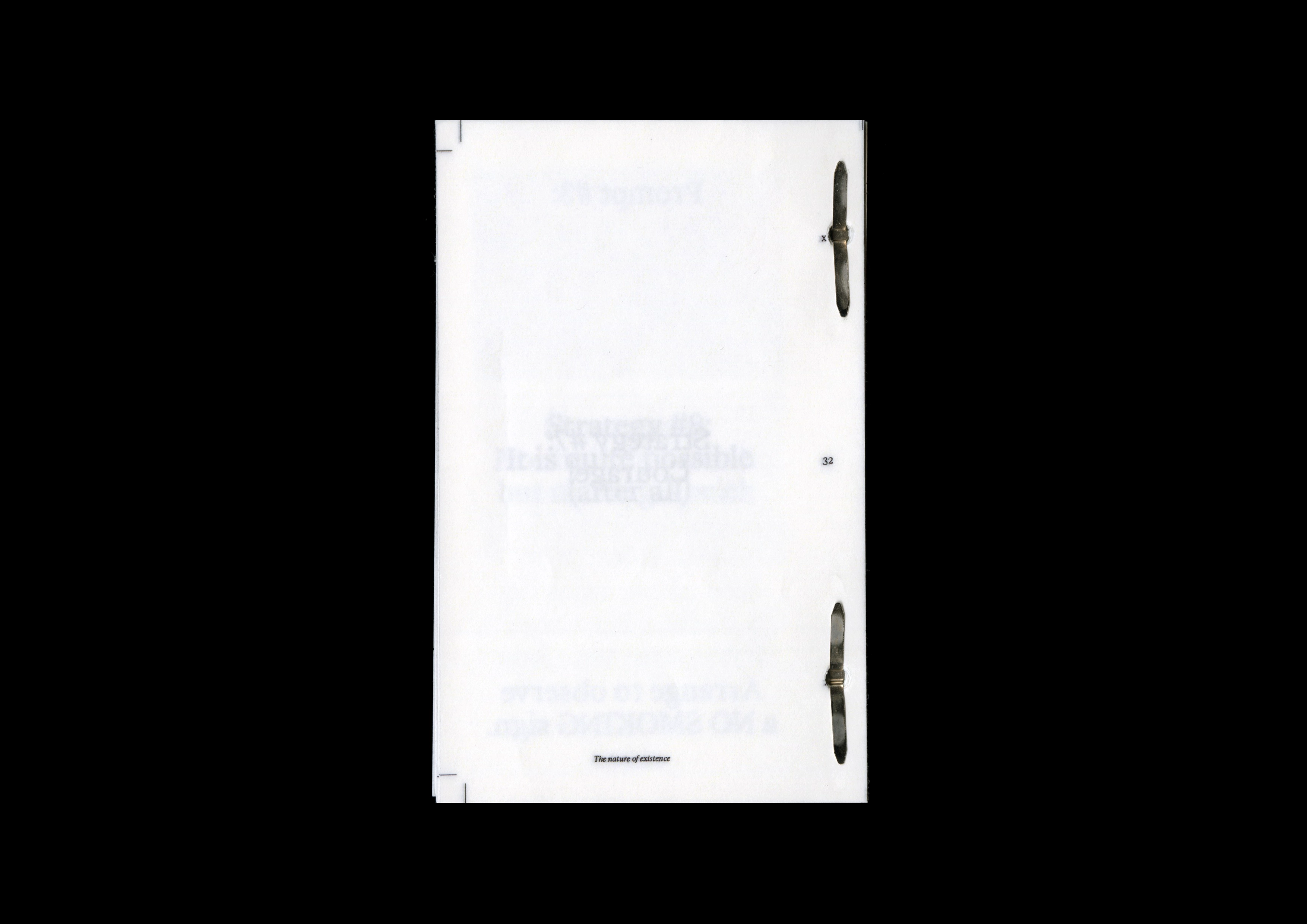
The nature of existence is to be unfinished
(Publication)
A pocket-sized collection of prompts, observations and strategies, for the thinker who: worries about appearing unrefined in the presence of others; feels the need to preface before sharing anthing; wonders if they are “living up to their potential”. The collection is a reminder to value progress over perfection (trite but true).
Impermanently bound with pins. Pages may be added as the reader wishes... an ongoing reminder that it is natural to be ‘unfinished’.
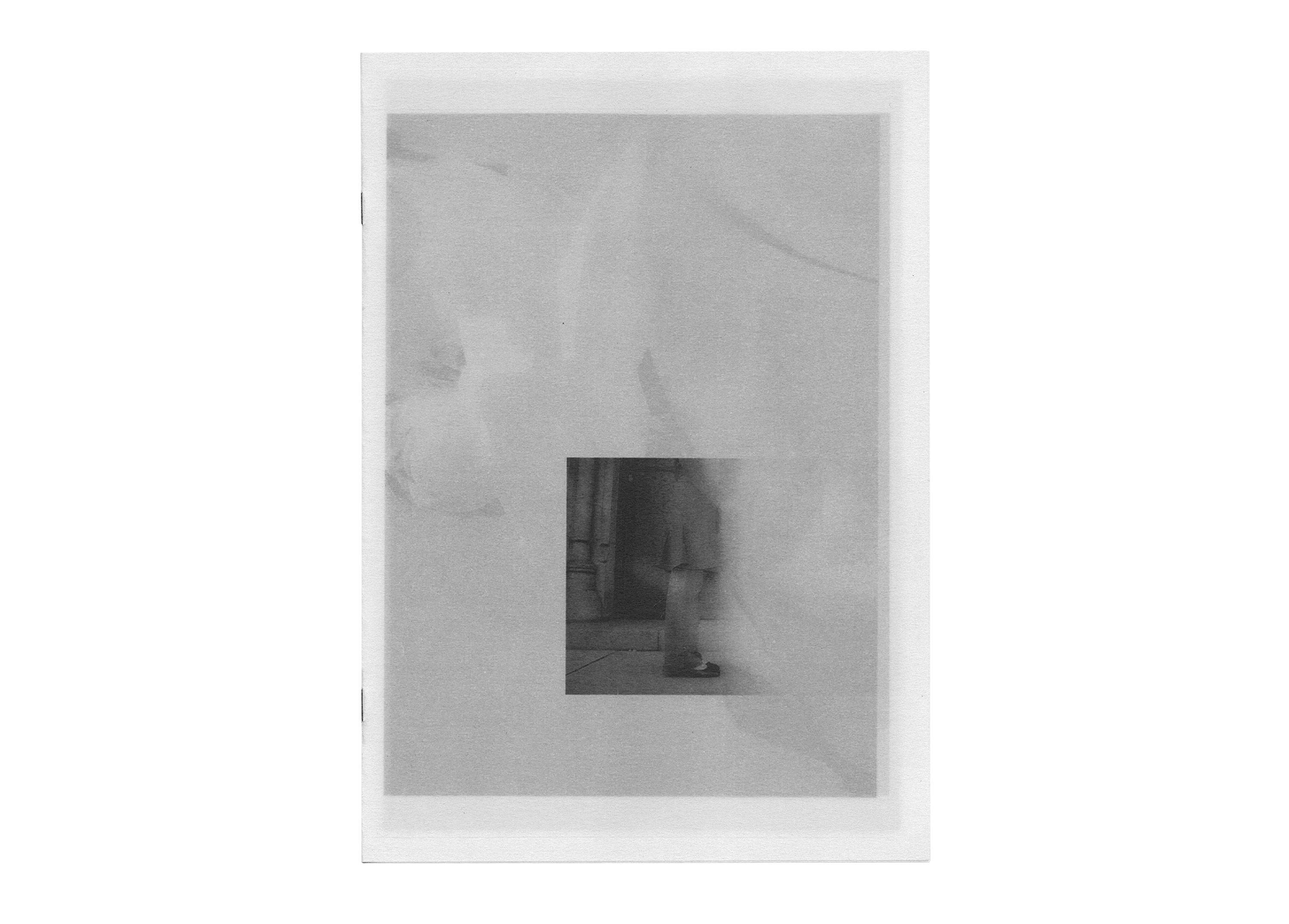
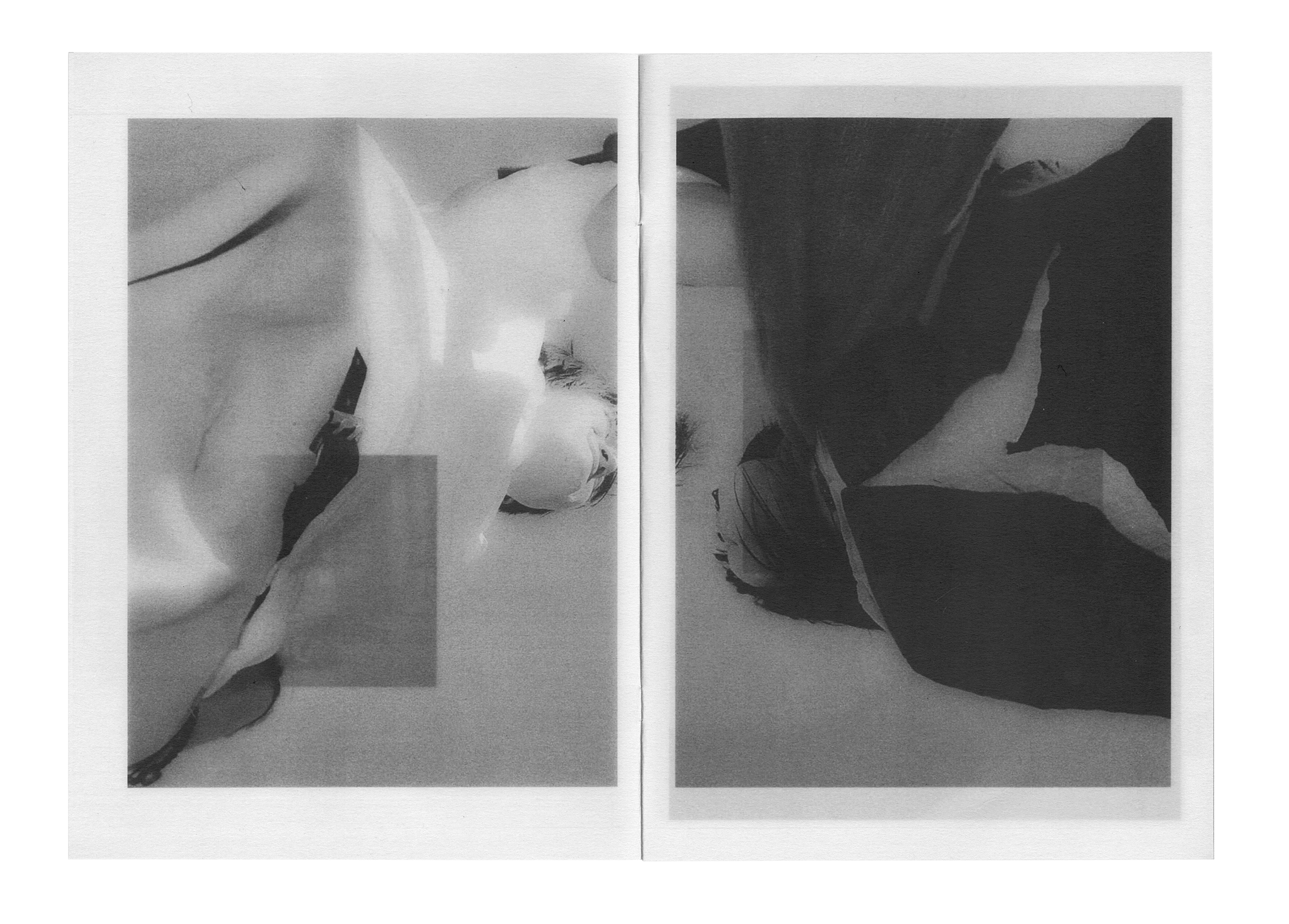
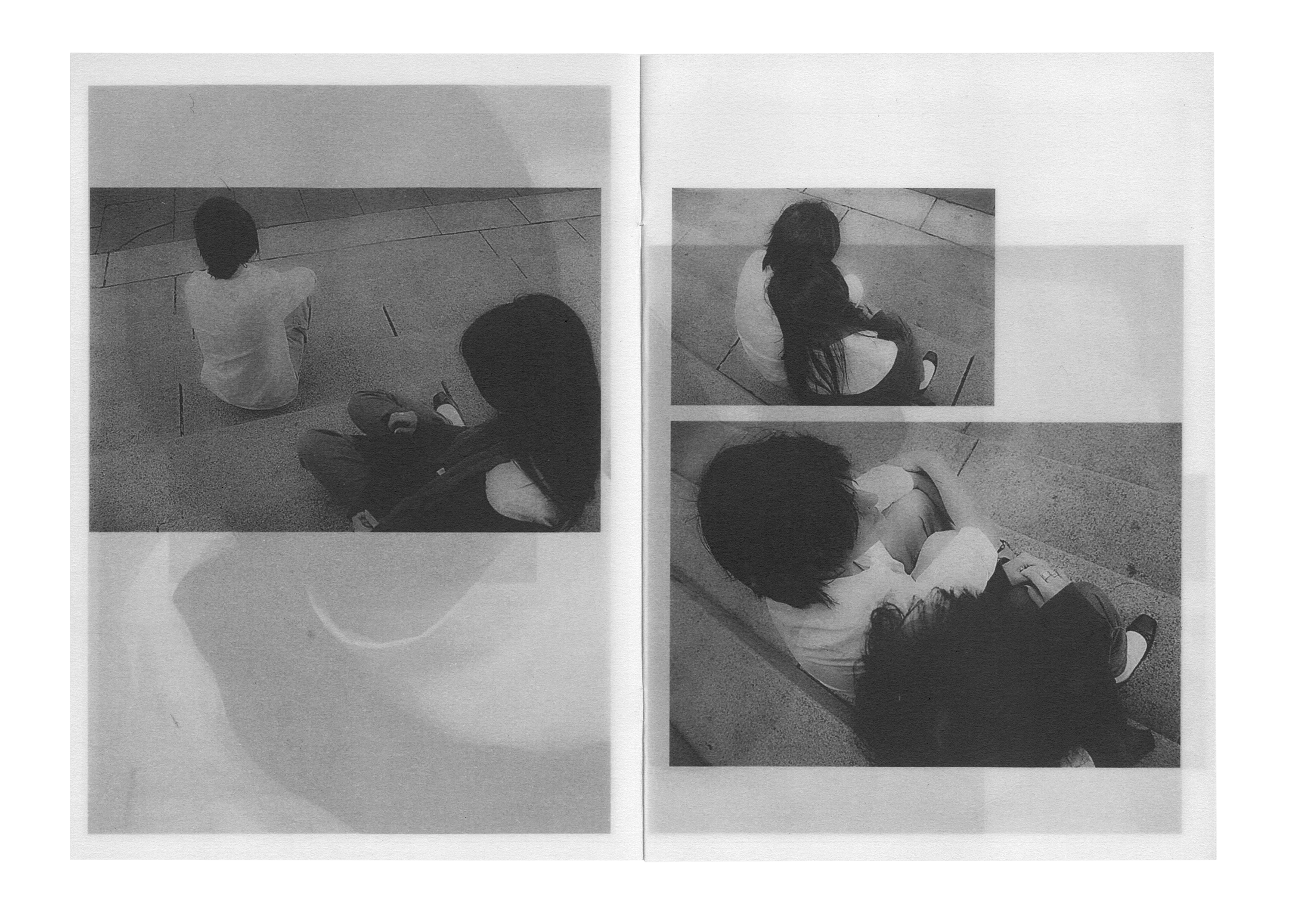
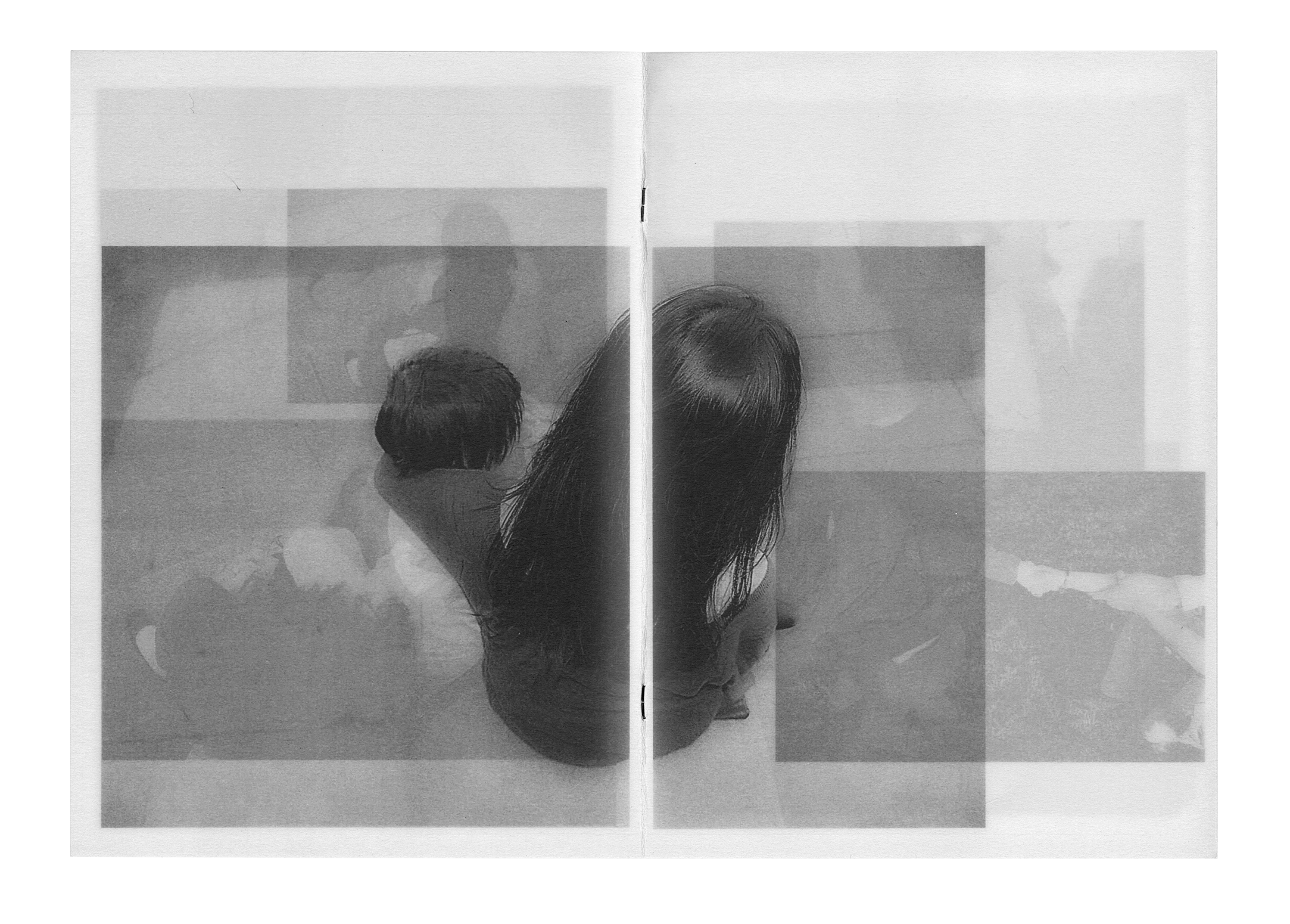
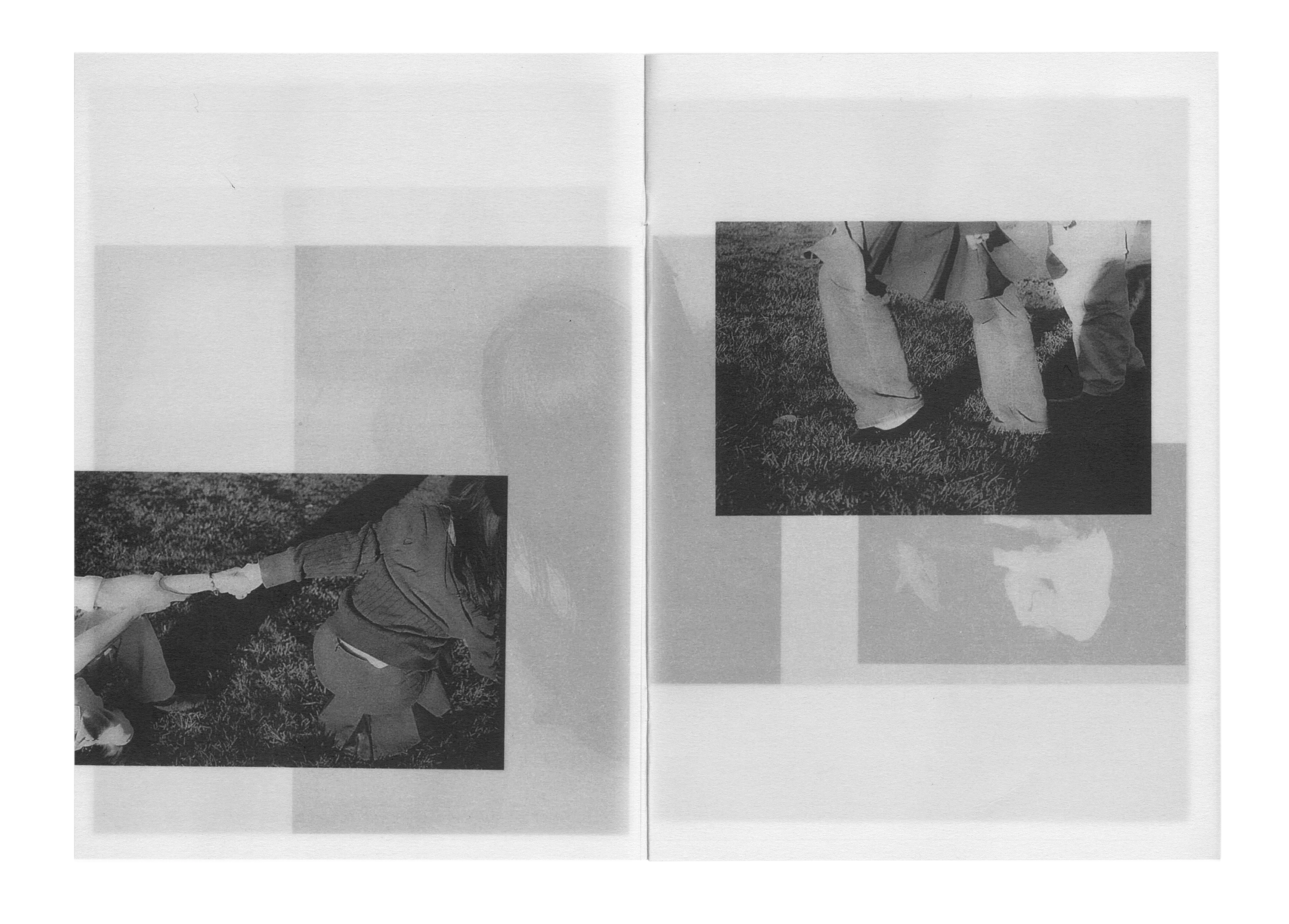
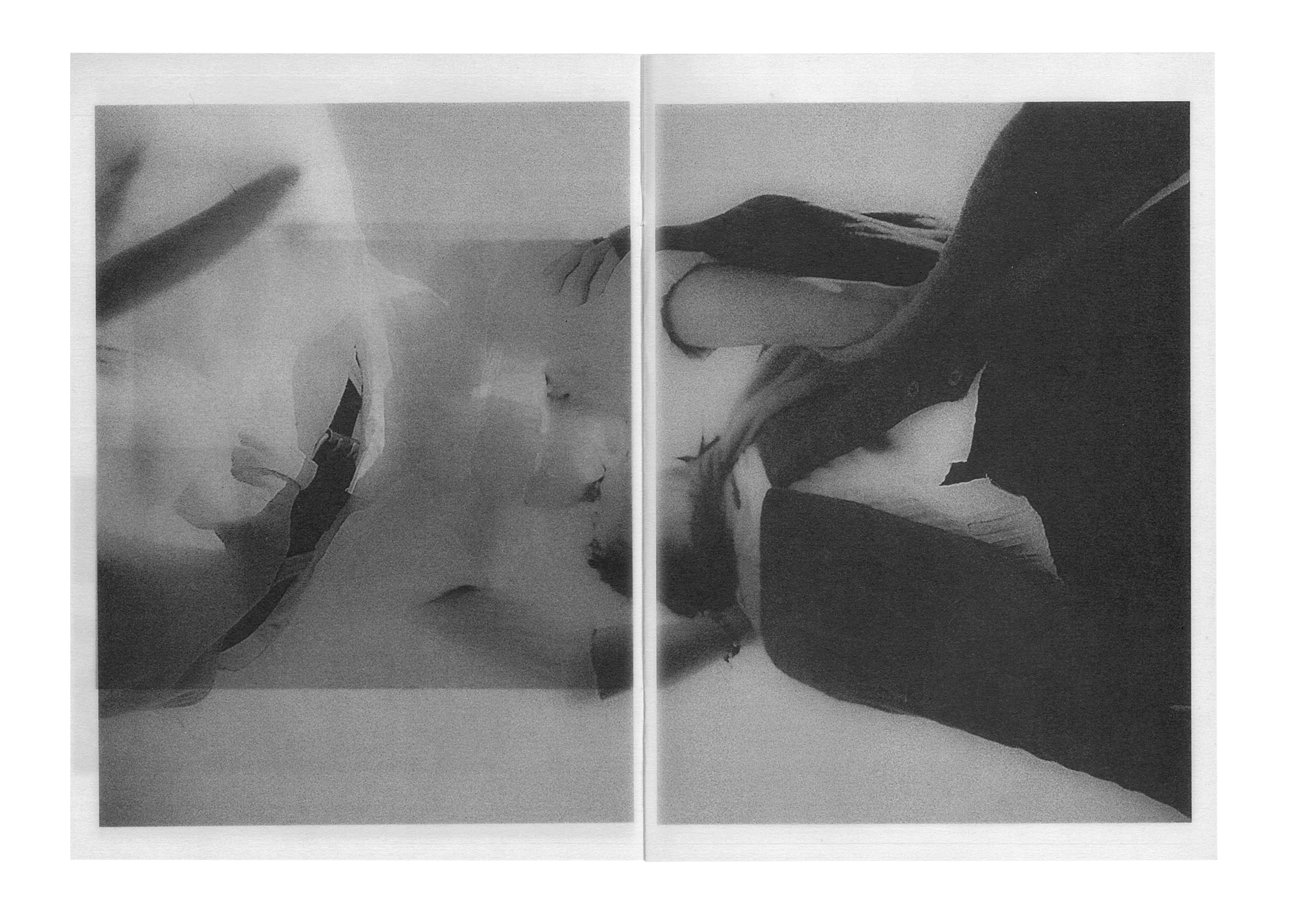
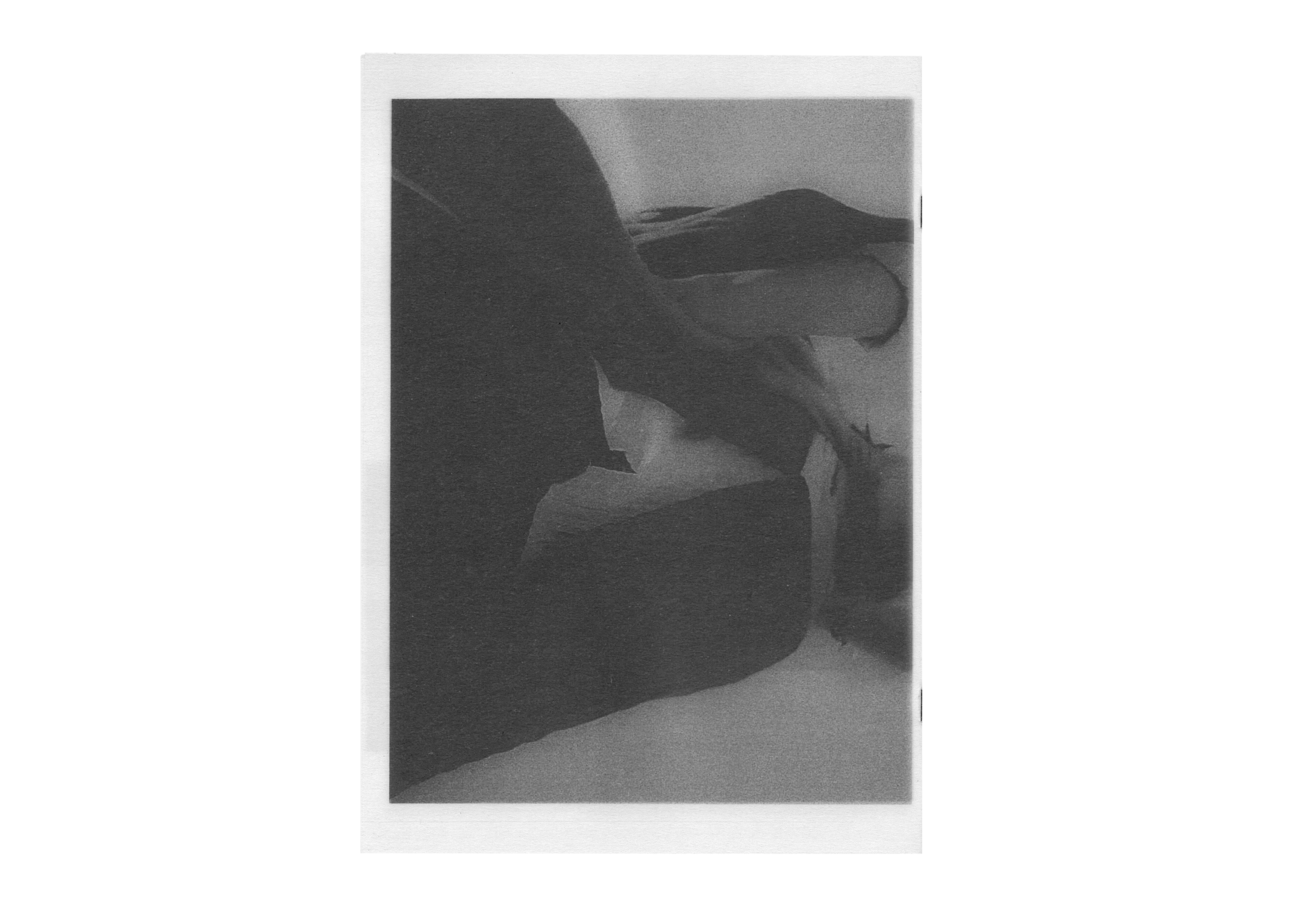
Corporeal
(Publication, Photography)
A photobook exploring demeanour through physical form (and tenderness).
What does gesture reveal in the absence of facial expression? All captured moments form a comprehensive study. They are parts of a bigger picture; several frames are visible simultaneously as all frames are interdependent. Printed on 90gsm vellum.
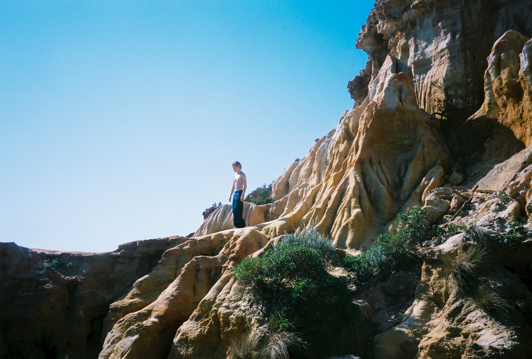
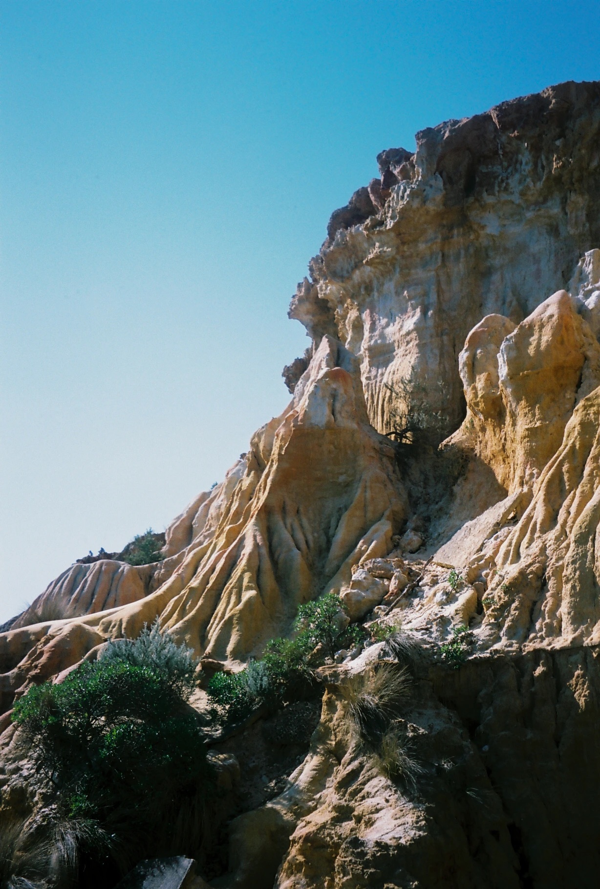
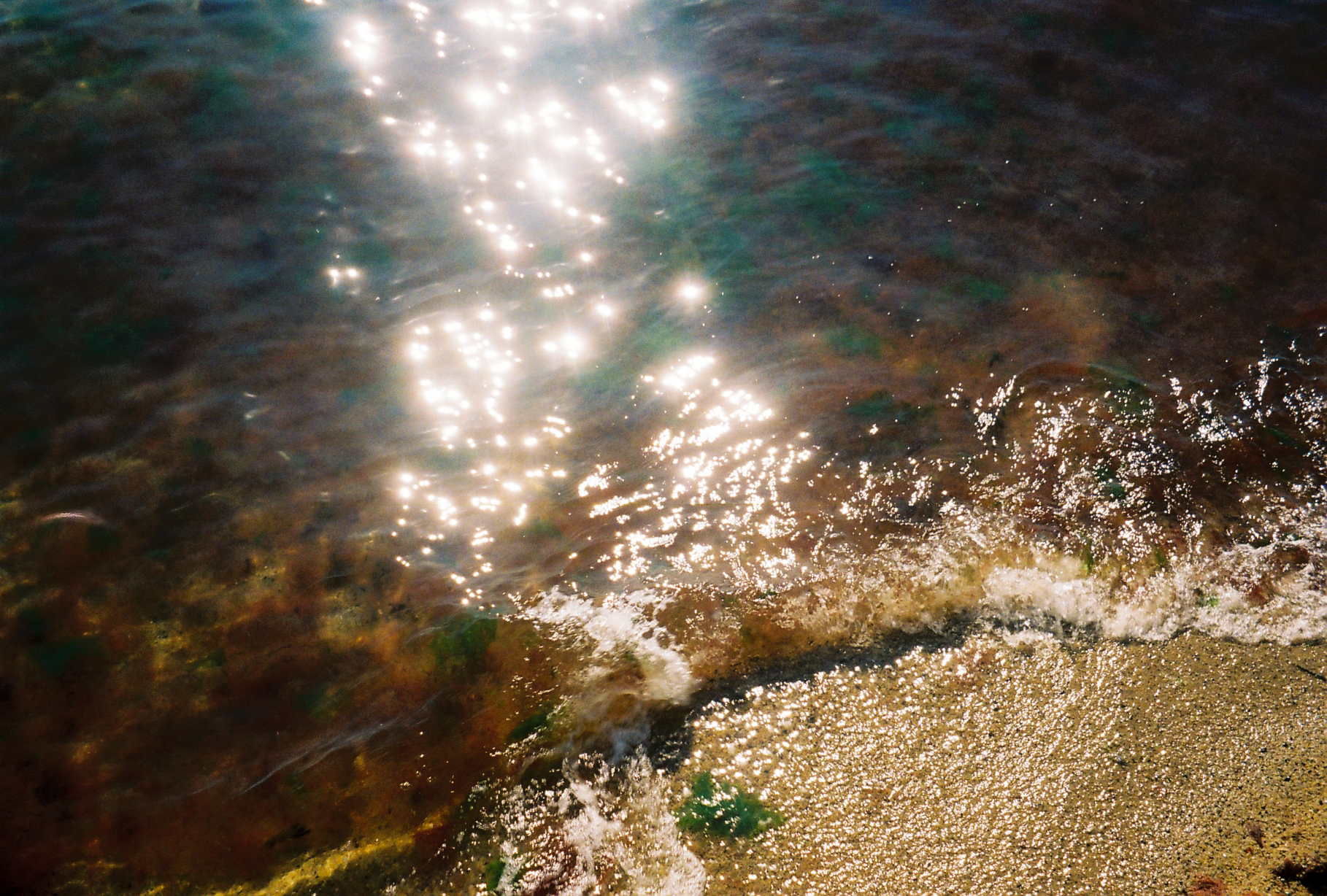
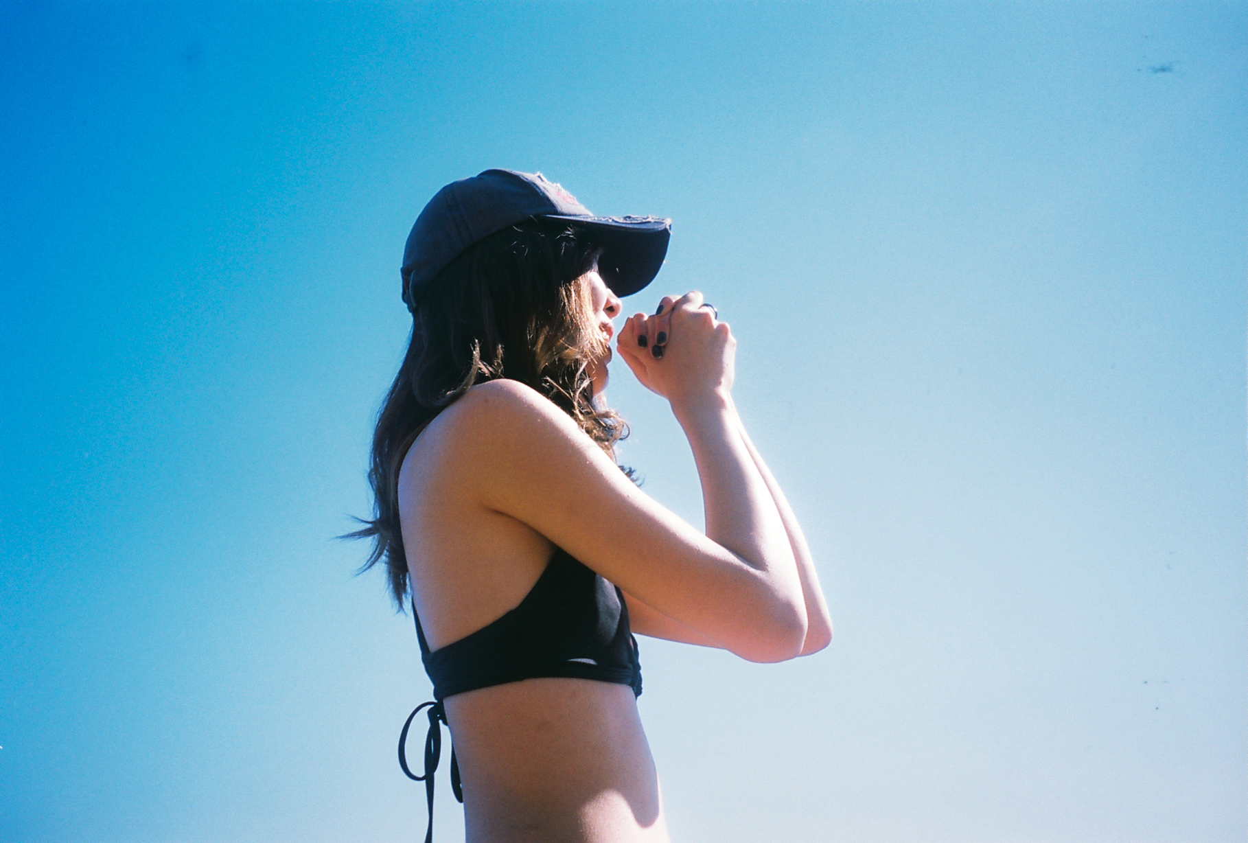
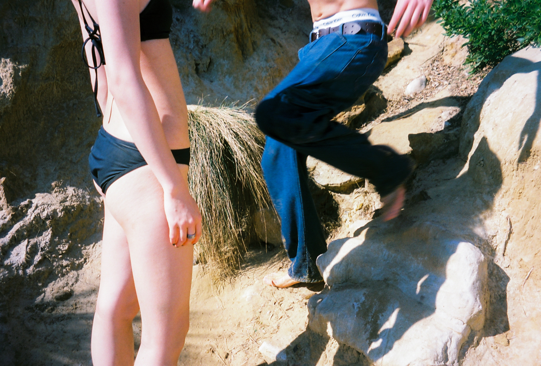
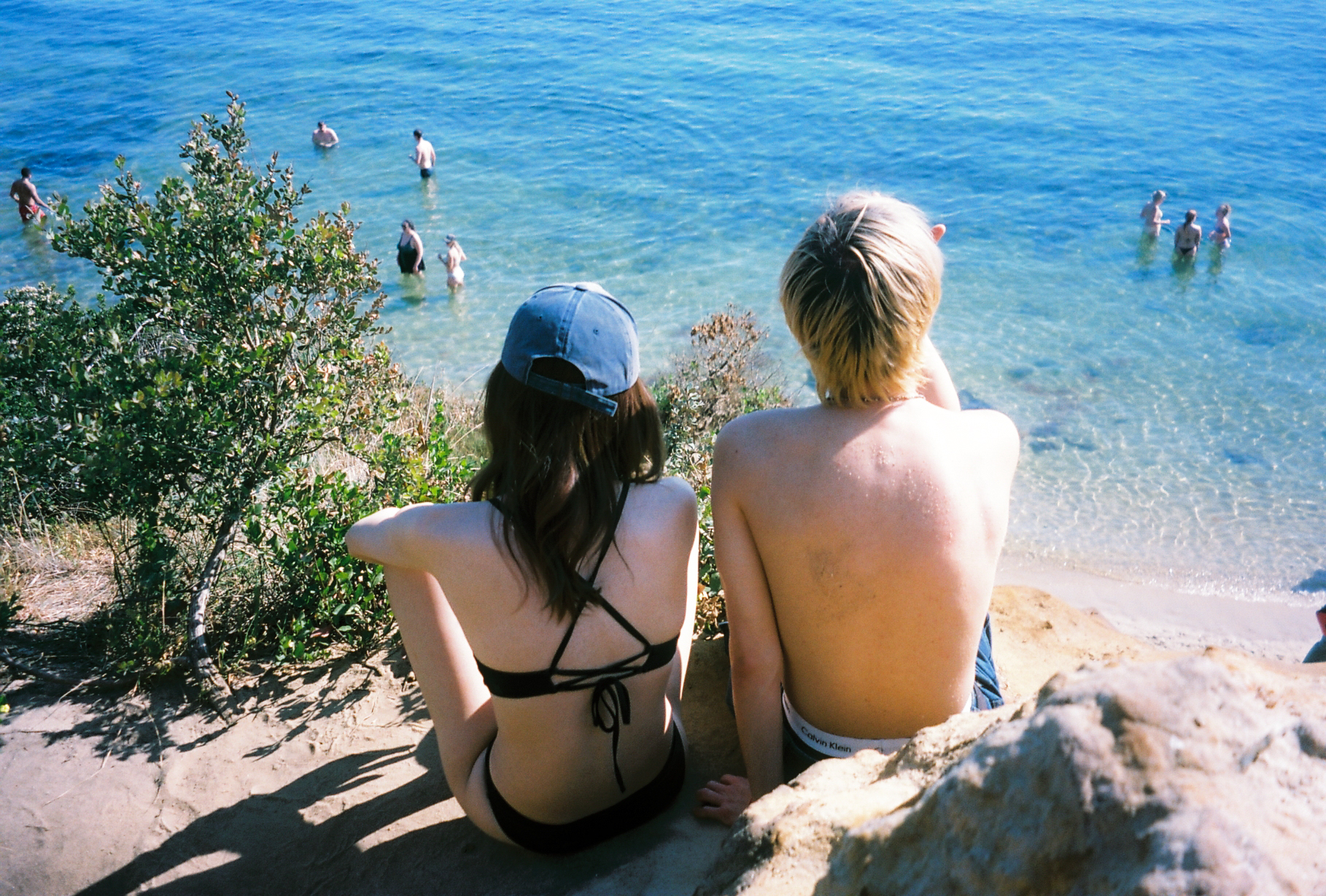
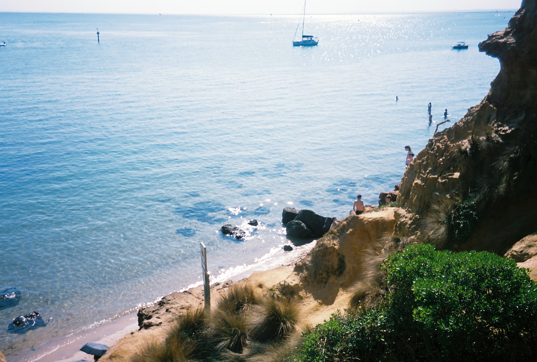
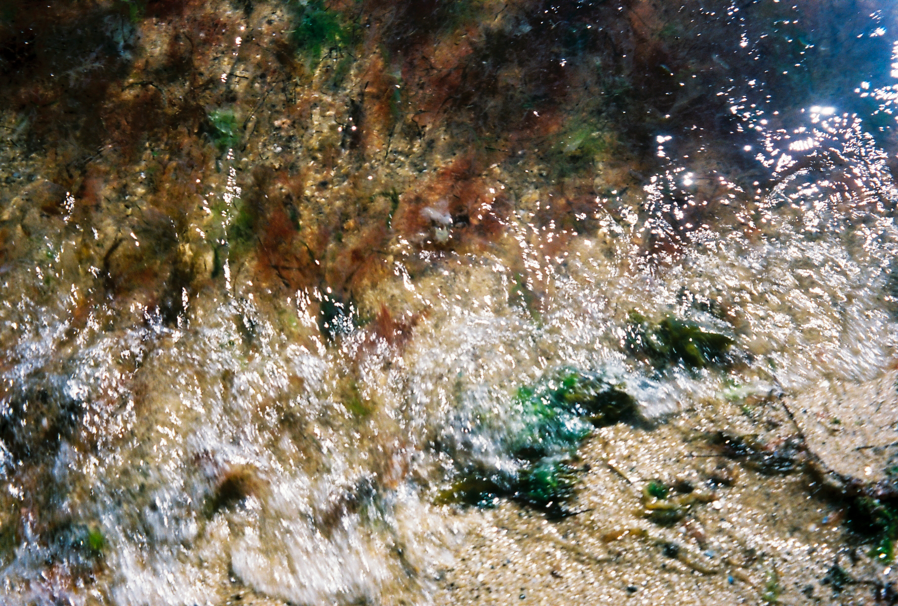
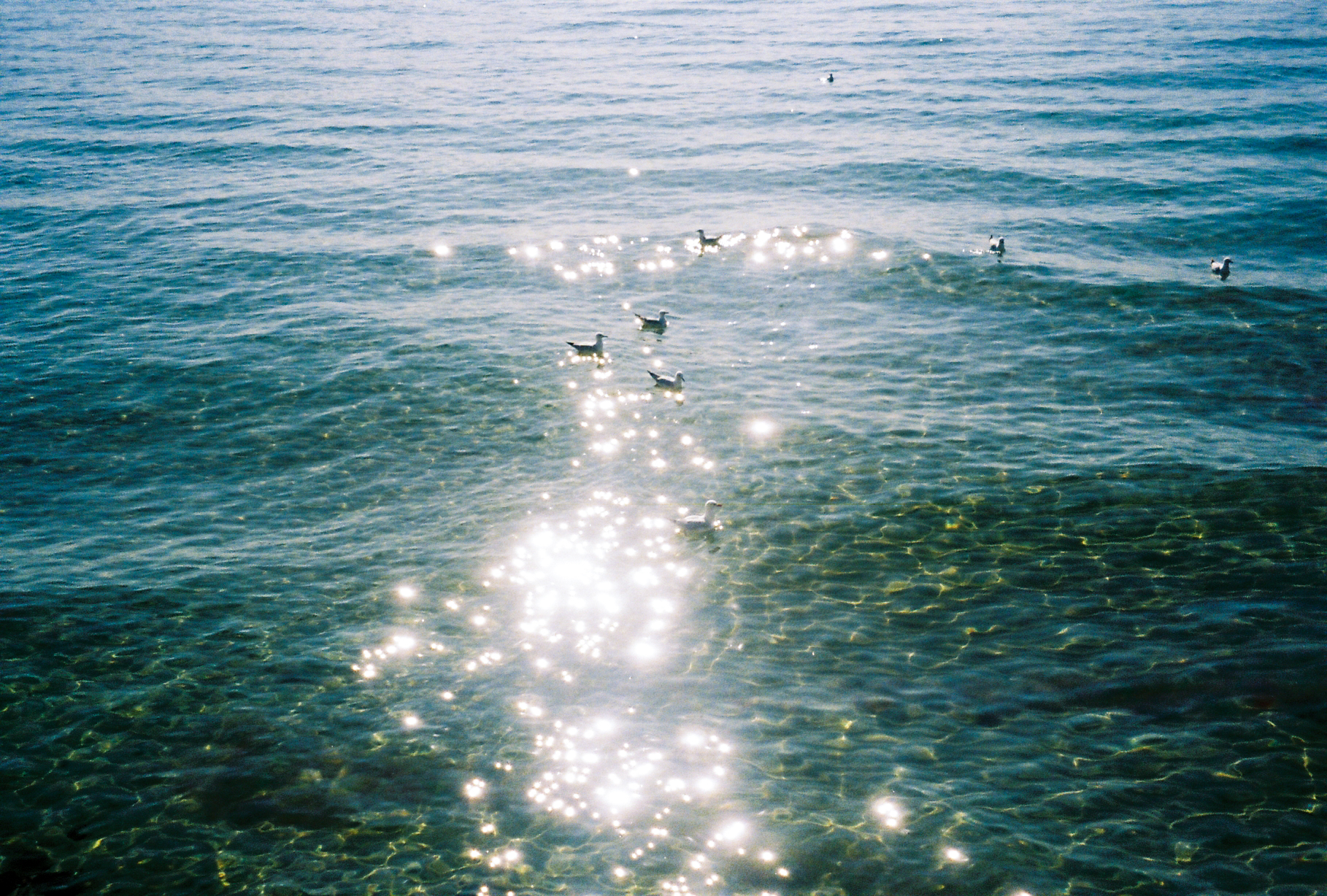
Caribbean Blue
(Photography)
A series in response to the chromatic impulse; the aversion of colour, a mistrust of colour, a fear of contamination or corruption through colour (Chromophobia—David Batchelor, 2000).
How was colour ever considered something ‘foreign’ and unworthy of serious consideration when the natural world offers so much?
A journey through place, from land to beyond, shot on 35mm film. Across the open sky, up mountains, down cliffs, and out to the endless sea. Colour is neither trivial nor threatening, it is the essence of life itself.
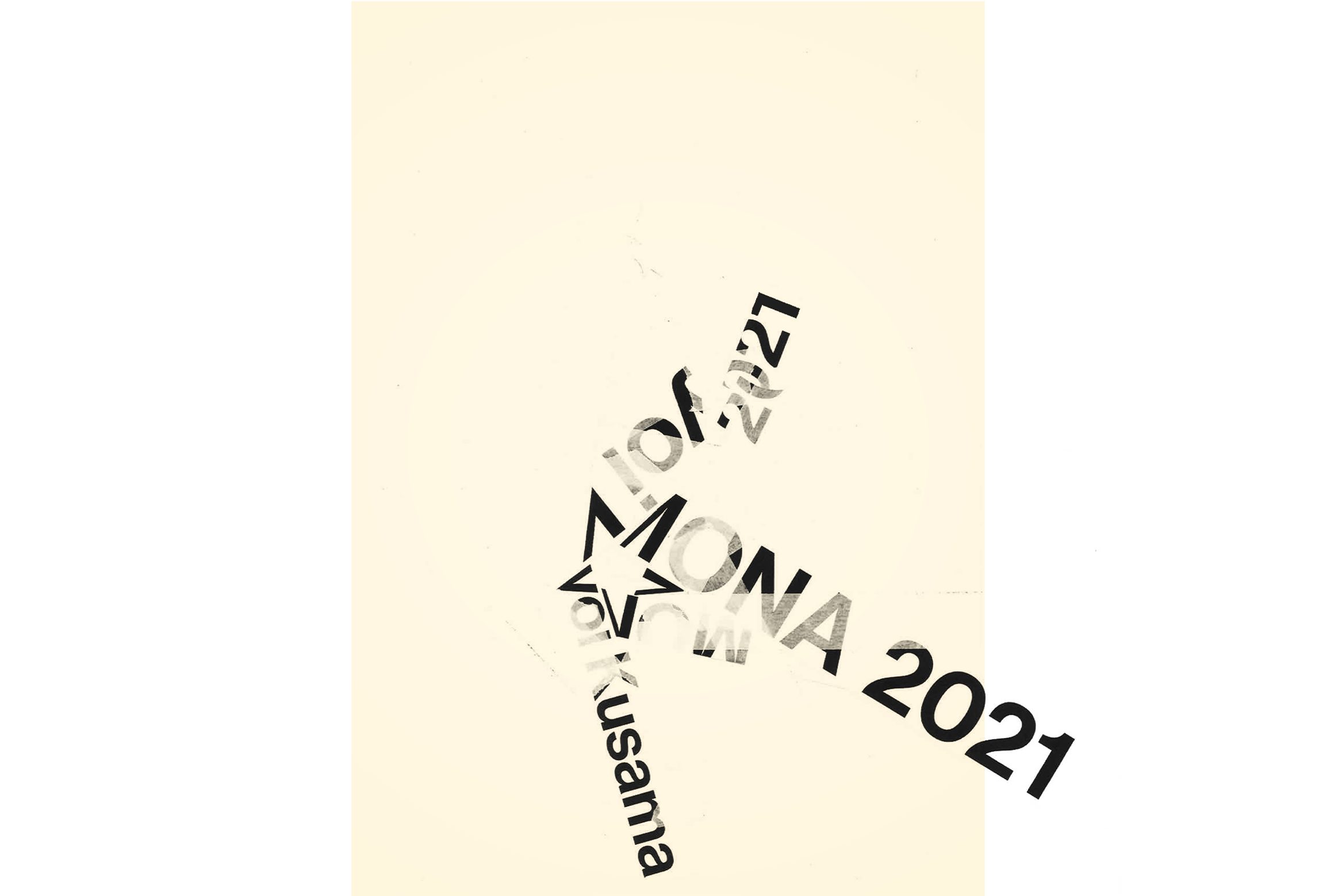
Kusama
(Typography)
Concept poster design for a Yayoi Kusama 2021 MONA exhibition, crafted with paper and masking tape.